
Planet Drupal
Dominique De Cooman: Dreaming about Drupal its long term potential
The Drop Times: Drupal GovCon 2024: LaunchDarkly and Drupal: A Solid Combo For A/B Testing
joshics.in: Why Drupal is the Ultimate CMS for Your Business: Flexibility, Security, and Scalability
When it comes to choosing a Content Management System (CMS) or framework, the options can be overwhelming. WordPress, Joomla, Squarespace, and many others each have their own strengths. However, there's one CMS that stands out among the rest for its power, flexibility, and scalability: Drupal. Here’s why Drupal should be at the top of your list.
Unmatched FlexibilityDrupal is known for its modular architecture, which allows developers to create highly customised solutions. Unlike WordPress and Squarespace that offer limited customisation out of the box, Drupal’s framework enables you to build virtually any type of website, from simple blogs to complex enterprise-level applications. Joomla also offers flexibility, but Drupal surpasses it with its extensive range of modules and themes.
Robust SecuritySecurity is a critical concern for any website owner. While WordPress is often targeted due to its vast user base, and Joomla has had its share of vulnerabilities, Drupal boasts one of the most secure CMS frameworks available. With a dedicated security team that actively works to identify and patch vulnerabilities, Drupal ensures that your site is well-protected against common cyber threats.
ScalabilityOne of the most compelling reasons to choose Drupal is its ability to scale. Whether you're running a small business website or a high-traffic enterprise portal, Drupal can handle your needs. Major websites like NASA trust Drupal to manage their vast amount of content and traffic demands. While WordPress can also scale, it may require significant customisation and optimisations, which come naturally to Drupal.
Active Community SupportDrupal has a large and active community of developers, designers, and contributors who constantly improve the platform. While WordPress boasts the largest community, Drupal’s community-driven approach means you benefit from a wide range of modules, themes, and plugins that can extend the functionality of your site. Joomla also has a strong community, but Drupal’s focus on high-quality, enterprise-level solutions sets it apart.
SEO-FriendlyHaving a website that ranks well on search engines is crucial. Drupal offers extensive SEO capabilities right out of the box, comparable to those of WordPress, which is often praised for its SEO plugins. From clean URLs to meta tags and mobile optimisation, Drupal provides the tools you need to ensure your site is easily discoverable by search engines. This built-in SEO functionality means you can focus more on your content and less on technical tweaks.
Cost-Effective in the Long RunWhile initial development costs for a Drupal site might be higher compared to simpler platforms like WordPress or Squarespace, the long-term benefits make it a cost-effective choice. Its robust architecture reduces the need for frequent redesigns or overhauls, ensuring you get a higher return on investment over time.
Integrated Digital EcosystemFor businesses looking to integrate their website with other digital tools and platforms, Drupal offers seamless integration capabilities. Whether it’s CRM systems, marketing automation tools, or e-commerce platforms, Drupal can easily connect with your existing digital ecosystem, streamlining your operations and enhancing user experience.
if you're looking for a CMS that offers unparalleled flexibility, robust security, scalability, active community support, SEO-friendliness, and long-term cost-effectiveness, Drupal is an excellent choice. Make the smart move and consider Drupal for your next project.
Drupal Drupal CMS Drupal Planet Add new commentPromet Source: DotNetNuke vs Drupal for Large Government Agencies
Specbee: Why we switched from GA4 to Matomo and How to set up Matomo in Drupal
The Drop Times: Getting Started with Dresktop: Managing Local Drupal Environments
Talking Drupal: Talking Drupal #465 - Greater Cleveland RTA
Today we are talking about The Greater Cleveland RTA, How they use Drupal, and how they built a Drupal team with guests Mike Cermak & Rithya Lath. We’ll also cover Geofield Directions as our module of the week.
For show notes visit: www.talkingDrupal.com/465
Topics- What does the Greater Cleveland RTA do
- Is the RTA a state agency
- What kind of Digital Service do you provide
- How does the GCRTA use Drupal
- Whay was Drupal selected
- Let's talk about the team
- How long has the team existed and how many people
- What type of skill makeup doest hte team have
- Local development and deployment
- Point and click learning, how do you keep up to speed now
- Day to day responsibilities
- Drupal con and Starshot
Rithya Lath - ral1239 Mike Cermak - riderta.com MikeCermak
HostsNic Laflin - nLighteneddevelopment.com nicxvan John Picozzi - epam.com johnpicozzi
MOTW CorrespondentMartin Anderson-Clutz - mandclu.com mandclu
- Brief description:
- Have you ever wanted to make it easy for visitors to your Drupal site to get directions to a location via Google Maps? There’s a module for that.
- Module name/project name:
- Brief history
- How old: created in Feb 2021 by Christopher Martin (ccjjmartin), though recent releases are by Allan Chappell (generalredneck)
- Versions available: 1.0.1, compatible with Drupal ^8.8 ^9 || ^10 ^11
- Maintainership
- Minimally maintained, Maintenance fixes only
- Security coverage
- Test coverage
- Documentation? Not even a README
- Number of open issues: 1 open issue, not a bug
- Usage stats:
- 26 sites
- Module features and usage
- The module provides a new field formatter, so you can install it and then update a view mode to use Geofield Directions. Now your content display will include a link to get directions
- You can figure the text of the link, whether the link should open in a new tab, the magnification of the destination map, and more
- The module also includes token support, so you can dynamically include things like the name of the location in the link text
- I think the only downside I can see is that because this is implemented as a formatter, you have to choose the directions link OR a map, where I could foresee sites wanting to show both
The Drop Times: Simplifying Complexity with Guidance
Dear Readers, With Drupal 11 now in full swing, users have had time to explore the new features and improvements this release brings. As the platform continues to mature, one aspect remains critically important: comprehensive and up-to-date documentation. Whether you're a newcomer or a seasoned Drupal developer, having reliable documentation is key to fully leveraging the capabilities of Drupal 11 and adapting to the changes it introduces.
A major focus of Drupal 11 has been improving user experience, such as simplifying the process for adding fields to entity types. While these changes make Drupal easier to use, they also require clear documentation to guide users through the new workflows. The Documentation and Help Initiative is vital here, ensuring that Drupal's power is accessible to everyone. Led by a dedicated team, this initiative aims to improve Drupal.org's resources and introduce a help system that provides assistance tailored to users' needs.
However, the documentation does more than explain the latest changes-it strategically makes Drupal more accessible to a broader audience. This is particularly true as we look toward the future with the upcoming "Drupal CMS," a product of the Drupal Starshot initiative. Drupal CMS aims to offer a more user-friendly, out-of-the-box experience, making it easier for those who might find Drupal Core's technical depth overwhelming. The documentation will be crucial in helping users understand the differences between Drupal CMS and Drupal Core, empowering them to choose the right tool for their needs and get started quickly.
As Drupal 11 continues to evolve, so too must its documentation. With features like Project Browser and Automatic Updates on the horizon, which promise to simplify Drupal's usability even further, the role of documentation in bridging the gap between technical advancements and user understanding becomes even more vital.
With that, let's move on to the important stories from last week.
DropTimes has put together a comprehensive FAQ to clarify the reasoning and implications behind Drupal Starshot's recent naming decision to be "Drupal CMS" instead of simply "Drupal." This guide is designed to help you understand the differences between Drupal Core and Drupal CMS.
In an interview with Kazima Abbaz, Selwyn Polit delves into the meticulous process behind creating "Drupal at Your Fingertips," offering detailed insights into how he curated and organized the content to serve as a comprehensive reference for Drupal developers. This guide aims to serve as a streamlined resource that cuts through the clutter, providing precisely what developers need when they need it.
In a world where tech startups often chase rapid growth at the expense of culture and sustainability, Iztok Smolic offers a refreshing alternative. As the CEO and Managing Director of Agiledrop, he has cultivated a unique company culture that blends traditional values with modern technological practices. In this interview, Iztok sits down with Elma John, a former sub-editor of The DropTimes, to discuss the inspirations and challenges that shaped his career and company.
Drupal GovCon 2024 recently concluded, marking a significant event for the Drupal community. Kazima Abbas has compiled key lessons from Rod Martin and Bree Benesh on Site building and leadership, from a session presented at the event. Mike Gifford, has presented the results from analyzing Drupal's dominance and accessibility in government websites which he had generously shared with The DropTimes.
Lenny Moskalyk has released a progress report on the Starshot initiative for August 2024. The initiative, announced by Dries Buytaert, is advancing through various focused tracks, each dedicated to different components of the platform.
Twin Cities Drupal Camp 2024 is just around the corner, taking place from September 12 to 13 in Minneapolis/St. Paul. With the event fast approaching, Drupal enthusiasts and web technology professionals are gearing up for two days of intensive learning and networking.
DrupalCon Singapore 2024 has announced a range of financial support options to make the event more accessible to the global Drupal community. DrupalSouth Melbourne 2025 is calling for volunteers to join its Event Committee, playing a crucial role in ensuring the successful execution of the conference.
In the news about DrupalCon Barcelona 2024, the event is set to feature keynotes by Dries Buytaert, Mónica Rikić, Theódór Ragnar Gíslason, and the Drupal Core Initiative Leads. DrupalCon also has a series of dynamic Contribution Events to bring together the global Drupal community to shape the platform's future. These events will run throughout the conference, culminating in a dedicated Contribution Day on Friday. DrupalCon Barcelona is also taking a stand against electronic waste by partnering with Trinijove, an organization dedicated to recycling and refurbishing old electronic devices.
Centarro has announced the release of Drupal Commerce 2.40 introducing a range of enhancements and new features. GitLab CI templates will soon make Drupal 11 the default version for automated testing, marking a significant transition within the Drupal ecosystem. Fran Garcia-Linares outlined this plan on Drupal.org, noting that GitLab CI currently supports simultaneous testing for both versions, which has allowed module maintainers to prepare for Drupal 11 compatibility.
We acknowledge that there are more stories to share. However, due to selection constraints, we must pause further exploration for now.
To get timely updates, follow us on LinkedIn, Twitter and Facebook. You can also, join us on Drupal Slack at #thedroptimes.
Thank you,
Sincerely
Alka Elizabeth
Sub-editor, The DropTimes.
Golems GABB: Mobile Apps Powered by Drupal Backend (Android, iOS)
There are new CMSs coming into the market almost every year. Aggregation of ratings and other dull figures are carried out to see how they match with each other. However, there is a solo survivor – Drupal among the rest. While this CMS has competed for the Viewers' Choice Awards for the last 10 years, its ratings have not ceased to soar. It has been used to build sites for UNICEF, Teach for America (website of the US Department of Education), Le Figaro (a well-known French newspaper), and others.
qtatech.com blog: Drupal et Progressive Web Apps (PWA)
Progressive Web Apps (PWA) provide an enhanced user experience by combining the features of web and mobile applications. For Drupal developers, integrating a PWA can transform a website into a high-performance mobile application. This article offers a technical approach to achieving this integration.
#! code: Drupal 11: Batch Processing Using Drush
This is the second part of a series of articles looking at the Batch API in Drupal. The Batch API is a system in Drupal that allows data to be processed in small chunks in order to prevent timeout errors or memory problems.
In the previous article we looked at how to setup the batch process using a form, with the batch methods being contained within the structure of the form class. When the form was submitted the batch process ran through 1,000 items and then printed out a result at the end.
Whilst there is nothing wrong with running the Batch API with everything in a form class, it is normally better to abstract the batch processing code into a separate class.
Using a separate batch class to contain the process and finish methods is a much better way of setting things up as it allows you to abstract away the batch process from the action that starts it. This means that you can start the batch from anywhere, even a Drush command.
Allowing you batch processes to be run via Drush is a really powerful feature for a module to include. It means that any big process that can be run by a user can be run automatically via a Drush command.
The Batch ClassTo create a batch class I normally create a directory called "Batch" inside the module "/src" directory that contains any batch class I need to define. The contents of the class are the two batch methods from the form class used previously, namely the batchProcess() and batchFinished() methods.
The following shows the basic structure of this class.
Darren Oh: From Drupal Forge trial sites to persistent hosting
Due to concerns that the launch button would funnel business to one vendor at the expense of others, Starshot leadership announced that the launch button would use WebAssembly to run site trials in a user’s browser without external hosting. This approach has the advantages of being able to run Drupal off line and not needing anyone to pay for hosting. However, it is technically challenging and will not work for everyone. Sites running in WebAssembly cannot be visited by others and are not persistent.
Darren Oh Fri, 08/30/2024 - 15:40 Tags- Read more about From Drupal Forge trial sites to persistent hosting
- Log in or register to post comments
The Drop Times: Frequently Asked Questions on 'Drupal CMS'
Darren Oh: Starshot ignites Drupal Forge
Drupal Starshot blog: Drupal Starshot Initiative update for the end of August 2024
Dries Buytaert announced recently that the product name for the result of the Drupal Starshot Initiative will be Drupal CMS. Exciting! Activities on features for Drupal CMS are divided into tracks - a set of deliverables focused to provide valuable solutions for different parts of the product strategy.
Let’s see what’s cooking in the Drupal CMS kitchen as since the announcement of the track leads, quite some work has been done. We are happy to share a brief overview to highlight the progress made!
The Events Track has been busy with transferring the Events recipe to the Drupal CMS and now we’ve got the beginnings of an event system. As with all the Drupal CMS components, the ultimate plan is for each one to be available as its own project, but at the same time all be developed within the same repo.
The Data Privacy / Compliance Track is busy developing a survey for the international audience. We are looking forward to sharing it with the community very soon.
The Trial Experience Track in coordination with the Drupal Association has devised a solution to leverage GitLab Pages. After checking in with the rest of the Drupal CMS team, it was decided the trial codebase would be added to the monolithic repository. You can find more details at the dedicated blog post by Matt Glaman.
The Starshot Demo Design System initiative is supporting the Experience Builder demo next month by providing Drupal-branded components within a design system theme. The team has made excellent progress and needs more help in the next two weeks to test components within Experience Builder. Learn how to get involved!
The SEO Track managed to add Basic SEO recipe to Drupal CMS. This recipe will be applied by default, is idempotent (can be applied multiple times), and sets the simple best practices configuration we feel every site needs. The team is continuing to work to define an advanced SEO recipe that we will propose to be optional that has more tools for optimizing for search engines.
The Advanced Search Track has drafted a proposal for the track. It is being reviewed by the leadership team and the idea is to provide a recipe for at least two different approaches and collect community feedback. We expect this to happen in September so stay tuned!
The Media Management Track is undertaking discovery to gather common practices and new insights that will lead to a proposal for the features and recipes for media in early versions of Drupal CMS. The track will also propose how improvements and innovations could look for media beyond the launch of Drupal CMS. Tony Barker has created a survey as part of the discovery and welcomes the community to provide their thoughts and feelings on media in Drupal using this form.
We are observing the progress each track team is making with excitement and will keep you up to date on upcoming developments!
mark.ie: My LocalGov Drupal contributions for week-ending August 30th, 2024
This week was all about catching up on notifications and open PRs from last week, and creating a mega amount of new PRs.
The Drop Times: Humility Over Hype: Iztok Smolic's Approach to Leadership and Community
Drupal Association blog: Drupal Association Announces Dropsolid as Partner for Drupal 7 Extended Security Support Provider Program
PORTLAND, Ore., 29 August 2024—The Drupal Association is pleased to announce Dropsolid as a partner for the Drupal 7 Extended Security Support Provider Program. This initiative aims to support Drupal 7 users by carefully selecting providers that deliver extended security support services beyond the 5 January 2025 end-of-life (EOL) date.
The Drupal 7 Extended Security Support Provider Program allows organizations that cannot migrate from Drupal 7 to newer versions by the EOL date to continue using a version of Drupal 7 that is secure and compliant. This program complements the Association’s Drupal 7 Certified Migration Providers Program, which helps organizations find the right partner to transition their sites from Drupal 7 to Drupal 11.
Dropsolid’s Drupal 7 extended support offers Drupal 7 support beyond 5 January 2024, with Enterprise Drupal specialists with a reputation in the community, access to enterprise Drupal 7 developers to continue development, and much more.
“We’re excited that Dropsolid has stepped up and committed to our Drupal 7 Extended Security Support Program,” commented Tim Doyle, CEO of the Drupal Association. “Dropsolid has been a tremendous supporter of Drupal and the Drupal Community, and we’re grateful that they’re including bona fide Drupal 7 support among their offerings.”
As organizations prepare for the transition from Drupal 7, Dropsolid will provide the necessary support to keep their sites secure and operational.
Dominique De Cooman, co-founder and co-CEO of Dropsolid, proudly added: “We are thrilled to qualify for the Drupal 7 Extended Security Support program. Even more so since we're the only European company selected (even though we have offices in US and EU). As an organization of makers contributing towards security of Drupal and Mautic, we want to continue contributing to Drupal as much as possible. It's part of our mission to give Drupal 7 the End of Life it deserves. Beyond EOL support, Dropsolid will continue to deliver robust D7 support at both the code and platform levels. We’re here to back you—past, present, and future.”
More information on Drupal 7 Extended Support from Dropsolid.
About the Drupal AssociationThe Drupal Association is a non-profit organization that fosters and supports the Drupal software project, the community, and its growth. Our mission is to drive innovation and adoption of Drupal as a high-impact digital public good, hand-in-hand with our open source community. Through various initiatives, events, and programs, the Drupal Association helps ensure the ongoing development and success of the Drupal project.
About DropsolidDriven by an open culture and with a passion for open source, Dropsolid shares their knowledge, code, and talent with their clients. Dropsolid designs, builds, hosts, evolves, and creates websites & DXP with results. Equipped with a CMS, marketing automation, personalization, and even AI. Starting from a strong digital strategy with one goal in mind: the best digital experiences for your organization and your customers and stakeholders.
Wim Leers: XB week 13: location, location & OpenAPI
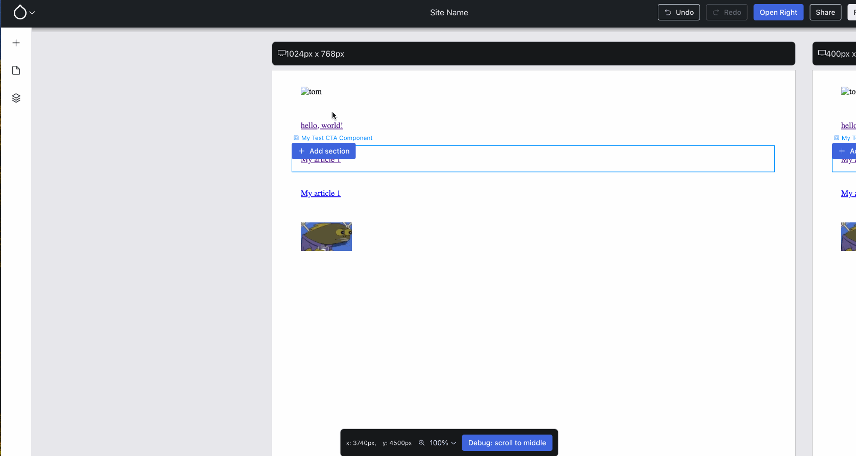
The first prominent leap forward this week was built by Harumi “hooroomoo” Jang: they added the ability to Experience Builder (XB) to first pick the location to add a component to, and then pick the component, rather than only the other way around:
Hovering a section (XB calls top-level components sections) now offers placing another section and triggers the component list form.
Issue #3460952, image by Harumi.
Clearly, it’s important to support both paths towards placing a component!
Great news: this week, Bálint “balintbrews” Kléri joined the team working on XB full-time :) Satisfyingly, he landed an improvement that he started working on as a volunteer contributor: #3458535: Middle click + drag doesn’t work correctly if middle click is inside preview iframe.
Utkarsh “utkarsh_33”, syeda-farheen, Harumi and Jesse “jessebaker” Baker fixed the undo/redo functionality and added end-to-end tests, ensuring that XB cannot regress anymore on that essential functionality.
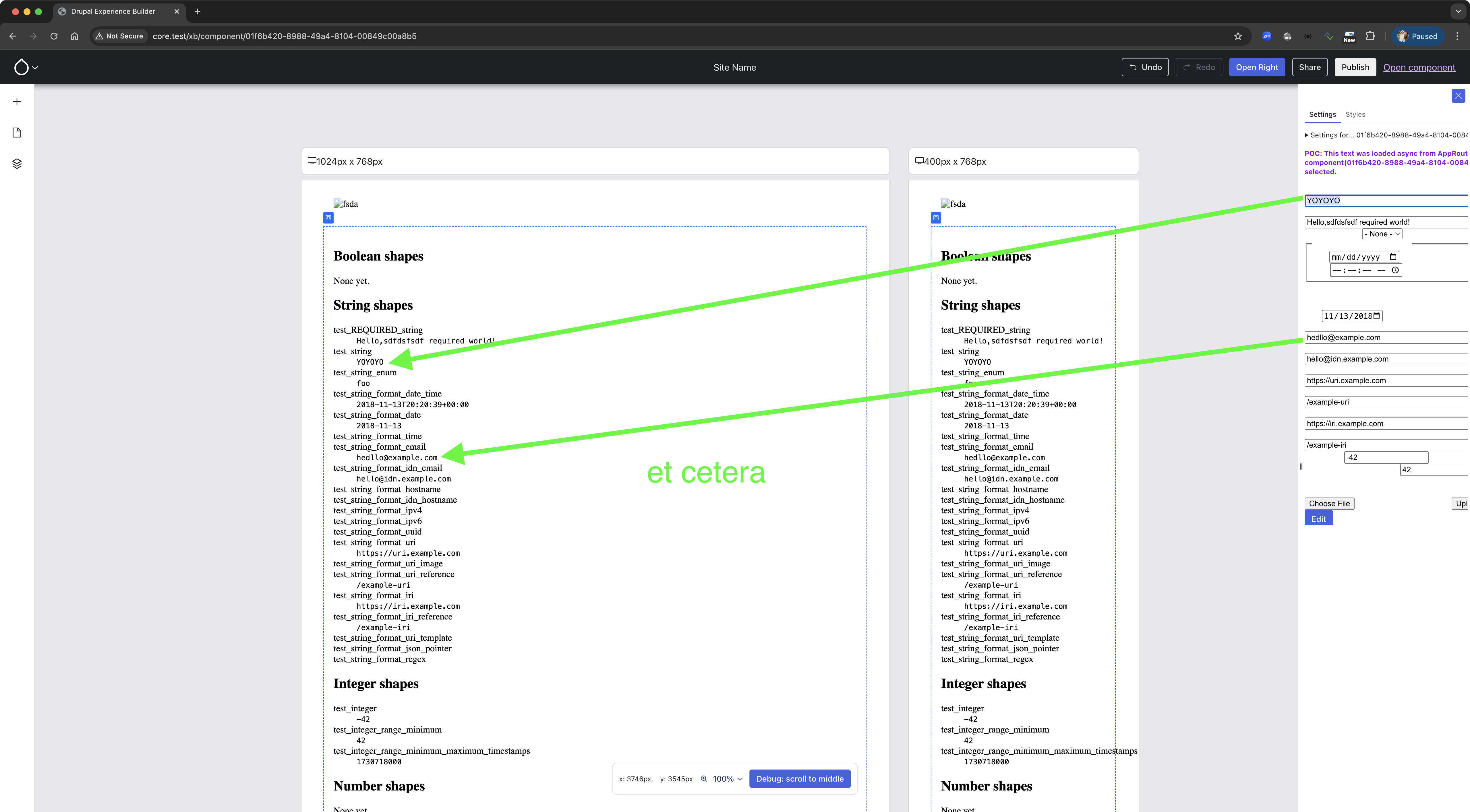
Ben “bnjmnm” Mullins and I collaborated to overhaul XB’s all-props test-only Single-Directory Component (SDC), whose purpose is solely to exercise the full spectrum of prop shapes (JSON schemas) that SDC can use:
The all-props test-only SDC facilitates testing/developing missing pieces of XB: it makes it easy to see the editing UX that is generated for a particular SDC prop shape.
Issue #3463583, image by Wim.
Last week, we landed component previews, and that was a big leap forward! We firmly believe in rapid iteration, and landing something as soon as it’s at least partially usable, rather than polishing it to perfection — for a mature codebase like Drupal core that makes sense, but not for something that is still in its infancy, like XB. So, unsurprisingly, we found an (obvious) bug: the preview caused styles to bleed:
Notice how pink outlines appear everywhere as soon as the Hero component is previewed — that’s obviously not the intent! :D
Issue #3466303, image by Jesse.
Jesse, Utkarsh and Gaurav “gauravvvv” used shadow DOM to properly encapsulate this.
Missed a prior week? See all posts tagged Experience Builder.
Goal: make it possible to follow high-level progress by reading ~5 minutes/week. I hope this empowers more people to contribute when their unique skills can best be put to use!
For more detail, join the #experience-builder Slack channel. Check out the pinned items at the top!
OpenAPI: constantly keeping front-end and back-end work in syncBack during week 3, Lee “larowlan” Rowlands opened an issue to create an OpenAPI spec for the (then) mock HTTP responses. Back then, the client (React, JS) and server (PHP, Drupal module) were being developed completely independently. Because things were still moving so rapidly back then, some request or response shape was changing almost daily, and nobody had OpenAPI experience … it sadly didn’t become a priority.
then, in the past ~5 or so weeks, having an OpenAPI spec that both the mocks and the actual server responses were validated against would have prevented several problems, and would have boosted productivity.
Thankfully, Philip “pfrilling” Frilling had already gotten significant parts working (and he was able to reuse Lee’s work on the Decoupled Layout Builder API module!). It was not yet mergeable because it didn’t validate the actual server responses yet.
So I started pushing it forward and ran into PHP dependency hell, was able to fix that, and then got us onto OpenAPI 3.1.0 (instead of 3.0.0), enabling XB’s openapi.yml to use patternProperties, without which we actually cannot express all of XB’s response shapes.
Hurray! A whole class of productivity blockers gone! (And Lee was right all along, of course.)
Shape matching woesLast week’s StorablePropShape worked okay, but Ted “tedbow” Bowman’s work on #3446722: Introduce an example set of representative SDC components; transition from “component list” to “component tree” revealed an interesting edge case: JSON object keys are always strings, so 50 is encoded as '50', meaning … the type is changed, and information is lost. Fortunately, Drupal core solved this a decade ago: we (re)discovered Drupal core’s ::storageSettingsFromConfigData(), which was added for precisely this purpose! A simple fix by Utkarsh “utkarsh_33” later, and we were good to go :)
That wasn’t the only problem #3446722 surfaced: we figured out why exactly the JSON schema validation refused to accept a sample value generated by Drupal core’s uri field type … and it turns out that’s simply because that field type indeed generates invalid URIs! We worked around it by swapping the class and overriding the logic to generate valid sample values. 1
In other words: matching the SDC props’ type information (expressed as JSON schema) against Drupal’s Typed Data/Entity/Field/Field Property type information (expressed as DataType plugins + validation constraints) is definitely revealing interesting problems that probably nobody else has been running into :D
P.S.: we set a new record by a significant margin this week: 16 MRs merged!
Week 13 was August 5–11, 2024.
-
We’ll eventually create upstream issues in Drupal core, but first we’re working accumulating a range of these kinds of problems, to identify the best strategy to fix this upstream. We’re now at ten overrides for field type classes, for a variety of reasons — most for missing validation constraints and/or incorrect field property class implementations. ↩︎
- Hovering a section (a top-level component) now offers placing another section and triggers the component list form.
- The all-props test-only SDC facilitates testing/developing missing pieces of XB: it makes it easy to see the editing UX.
- Notice how pink outlines appear everywhere as soon as the Hero component is previewed.
Skynet Technologies USA LLC Blogs: How to maximize WCAG and ADA accessibility for Drupal multi-language sites? – Best Practices!
Pages
Recent Publications
- Managing Hidden Dependencies in OO Software: a Study Based on Open Source Projects
- Open Source Communities as Liminal Ecosystems
- Investigating developers' email discussions during decision-making in Python language evolution
- Developers, Quality Control and Download Volume in Open Source Software (OSS) Projects
More...FLOSS Project Planets
FLOSS Research
- Give Your Input on the State of Open Source Survey
- Open Data and Open Source AI: Charting a course to get more of both
- The Open Source Initiative and the Eclipse Foundation to Collaborate on Shaping Open Source AI (OSAI) Public Policy
- ClearlyDefined v2.0 adds support for LicenseRefs
- ClearlyDefined at SOSS Fusion 2024: a collaborative solution to Open Source license compliance