
Planet Drupal
mandclu: Barcelona Update: Starshot Events Recipe Track
With DrupalCon Barcelona fast approaching I thought it was time to share some more updates on the progress of the events recipe for Drupal CMS a.k.a. the Starshot initiative.
mandclu Sep 20, 2024 - 9:27am TagsThe Drop Times: 'Local Association Stand' at DrupalCon Barcelona 2024
Promet Source: Get to Know Provus®EDU: Our Higher Ed Drupal Distro
eiriksm.dev: - I think I said “wait that’s all?” out loud!
From time to time I get some really good and motivating feedback on the product I have built, violinist.io. And I want to start this post, which will also have a huge feature announcement, by mentioning a couple of them:
It was wonderfully painless (...) I don’t think I’ve ever experienced a faster setup of a CI tool — I think I said “wait that’s all?” out loud!
overall did the trick of what I was looking for and was very very fast
In other words, easy to set up, and fast results.
Well, today I want to share another product update that will make it theoretically even faster to set up and get results. But first allow me to provide a bit of background on why this new feature came to be.
One recurring question we get is regarding two avenues of a similar aspect:
- Does our code have to make its way to violinist.io infrastructure for us to be able to use the service?
- Can violinist.io access our Self Hosted GitLab which is locked down with a required VPN connection
They might differ a bit in wording or actual focus, but they usually boil down to one of these. And from time to time we find a compromise to both of these questions together, and the person contacting us turn into happy customers. But from time to time these questions also become the actual blocker for them to start using violinist.io. But now, at least, we have an alternative that covers both of these use cases: Self hosting violinist.io runners!
And here is why I am mentioning the feedback regarding quick onboarding in the context of this product announcement. You can literally start an update check with one docker command:
docker run \ --pull=always \ -e "LICENCE_KEY=my_key" \ -e "PROJECT_URL=https://github.com/user/repo" \ -e "USER_TOKEN=ghp_jYgGb_1npvkiHTdnM" \ ghcr.io/violinist-dev/update-check-runner:8.3-multi-composer-2This will run the same update job as if it were running on violinist.io, only using your own computer!
Of course, this in itself is not super useful. Avoiding running commands on your computer is the whole point of using an automatic update service like violinist.io, but now you can do cool stuff like:
- Run the same update jobs as violinist.io without any code entering any third party infrastructure
- Run jobs your CI infrastructure of choice. GitHub Actions, CircleCI, Bitbucket pipelines, Self Hosted GitLab, your totally locked down VPN protected GitLab instance that has a totally locked down Jenkins server. And so on
- Decide your own intervals for running them, probably inside said CI infrastructure. Daily jobs? Weekly jobs? Hourly jobs? Not a problem.
- Compose CI workflows that can do all your repositories in a matrix, all on the same schedule, if useful?
- Expose a webhook to trigger jobs, and run them when new items appear in the Drupal Security Announcements RSS feed
- And a million other things probably? You decide!
If this sounds useful to you, or your organization, please don’t hesitate to reach out for a free trial. In fact, in the name of smooth onboarding, here is an absolutely free trial for you already without reaching out (as long as you are reading and using this within 2 months of this blog post): A totally free license key, valid for all repositories for 2 months from today (valid until 2024-11-19T19:20:19+01:00):
hc1NTsMwFATgHqXyCZ6f_-2V_RyvkLgAmzRYYLVqqiaqQKhSz9CrIA6T2xAWbGE50nwz9-Vr-Xz0Ajy7tPHQjm2anx7aUI9Dpdc67H8D8-g_Ji-sZ5u_m5v6dmrndxaa50YgSJDchZXq_-lzP_cs9J7_fPEV1HZu-2m7O4wv29M4zSzsPA_X63LLWKJb1w1SykKlRJgFoXRFR25AaZ6M48KgJKFJAdlM0kEU2bpkEYwCRBdBpqisQuIl6yyh01QKqNIZqUvXRcgchS0KxWohko3JKecgfQMNow all you need is a repository and a PAT (Personal Access Token), and you are off on your new automatic update adventure. For a bit more documentation than this sparse promotional blog post, please visit the container repository.
Lastly, there are so much more I want to share and address about this. For example the aspect of open source in all of this, the differences between this and violinist.io (the SaaS), the licencing and pricing aspect. But those are all blog posts on their own. For now, I hope you will try it out if it’s useful, and that you want to connect should you have any questions or concerns. Here in the comments, or by reaching out.
Let’s close up this blog post with an animated gif of "runners".
mark.ie: My LocalGov Drupal contributions for week-ending September 20th, 2024
Do one thing, do it well - this week I spent most of my time creating a live preview module for microsites.
Oliver Davies' daily list: The two ways of writing PHP code
Something that came up in my discussion with Dave Liddament for the Beyond Blocks podcast was that there seem to be two ways of writing PHP code.
One is writing strict code by enabling strict typing, using parameter and return types, and leveraging tools like PHPStan at a high level to analyze code.
The other is no not use types and to use a more "duck typing" approach.
The term "visual debt" came from a video discussing the pros and cons of these approaches.
The same can be said for JavaScript and TypeScript, but PHP can do both and gives the Developer the choice of how they write their code.
I prefer writing strict code and for my code to be as explicit as possible, but I appreciate not everyone does and I like that PHP caters for both.
How do you write your PHP code?
Liip: blökkli Starterkit released
Meet the blökkli starterkit for Drupal.
Spin-up a preconfigured Decoupled Drupal setup with Nuxt 3, GraphQL and blökkli to get started developing within seconds.
Enjoy the powerful and elegant editing experience offered by blokk.li, a fully interactive in-page editor based on the well-known Drupal Paragraphs module.
-
Out of the box support experience with local setup using Lando or DDEV
-
Drupal Backend Setup with GraphQL, Paragraphs and Paragraphs blokk.li module enabled
-
+40 Vue Components and Composables ready to build paragraph based Drupal websites
-
Basic Frontend setup with Nuxt 3 and GraphQL Middleware included
-
Multilanguage support with language negotation and translation support
-
Key-based Texts managed in Drupal combined with translation extraction in the frontend
-
SVG Icon Sprite generation with Drupal Media Library integration
-
rokka.io Image CDN integration and Drupal media library integration
-
Reverse proxy configuration generator included
We are looking forward to getting your feedback in the issue queue and on slack.
If you happen to be in Barcelona for DrupalCon, find us at the following dates:
-
Session: Large-scale content creation with Drupal — Delights, Pitfalls and support structures to help editors by Jonathan Noack (Jonock), Thomas Nagy (Thomnagy)
Wednesday, September 25, 2024 - 11:30 to 12:15
Room 1 (133-134) -
BoF: blökkli - Demo, Q&A for the Interactive page building experience with Nuxt
Thursday, September 26, 2024 - 16:30 to 17:15
Room BoF 1 (118)
Lullabot: Untangling Your Drupal Migration: Lessons from the State of Iowa
Migrating your content to a new CMS can feel daunting. You have years and years of content to sort through and move over, and you have no idea what obstacles might be hiding in the weeds. In the back of your mind, the question looms: “Do we really need all of this content?”
You don’t want to waste time. But you also don’t want to miss anything important.
Wim Leers: XB week 17: drag and drop party
We matched last week’s record: again 26 MRs merged! :D
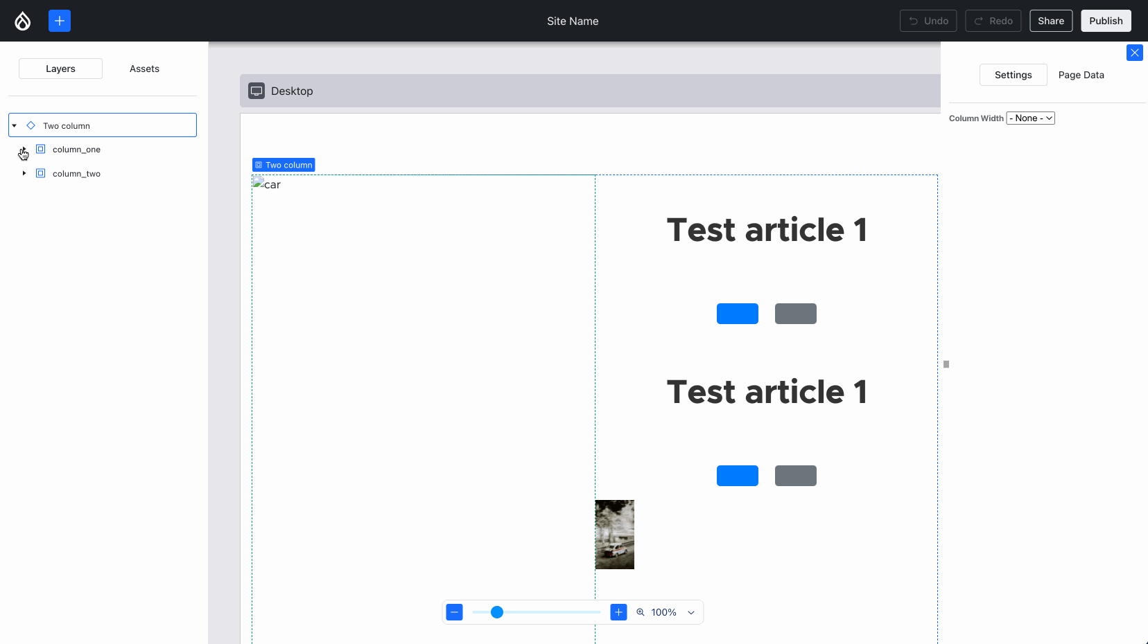
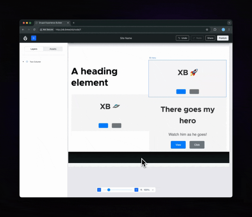
Experience Builder (XB) already had a hierarchy view for a while. Lauri worked with the Acquia UX team to change that to match the more common “layers” pattern (used in Photoshop and Figma). Harumi “hooroomoo” Jang made that a reality:
The new “layers” panel, which also allows moving components.
Issue #3458503, image by Harumi.
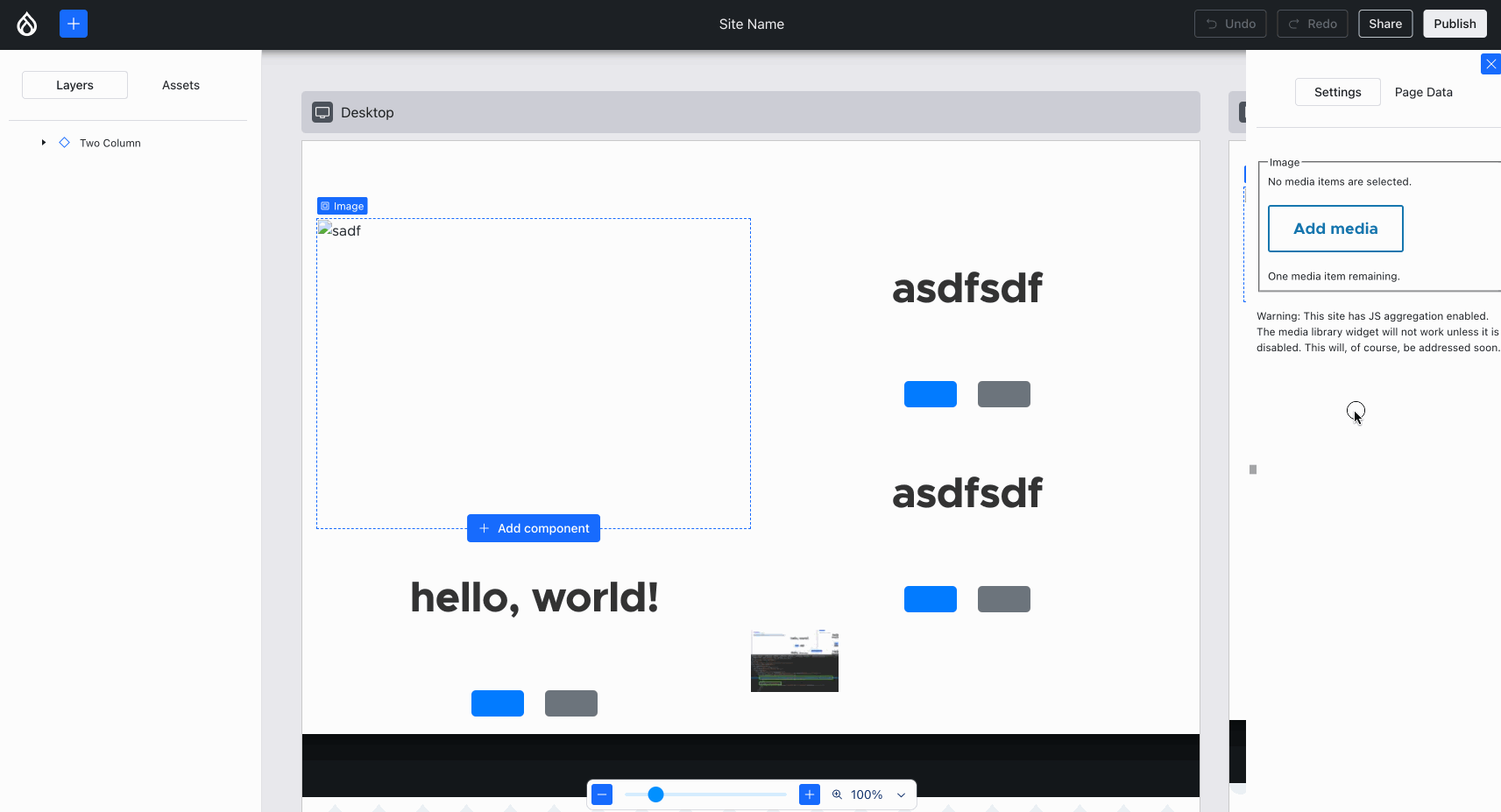
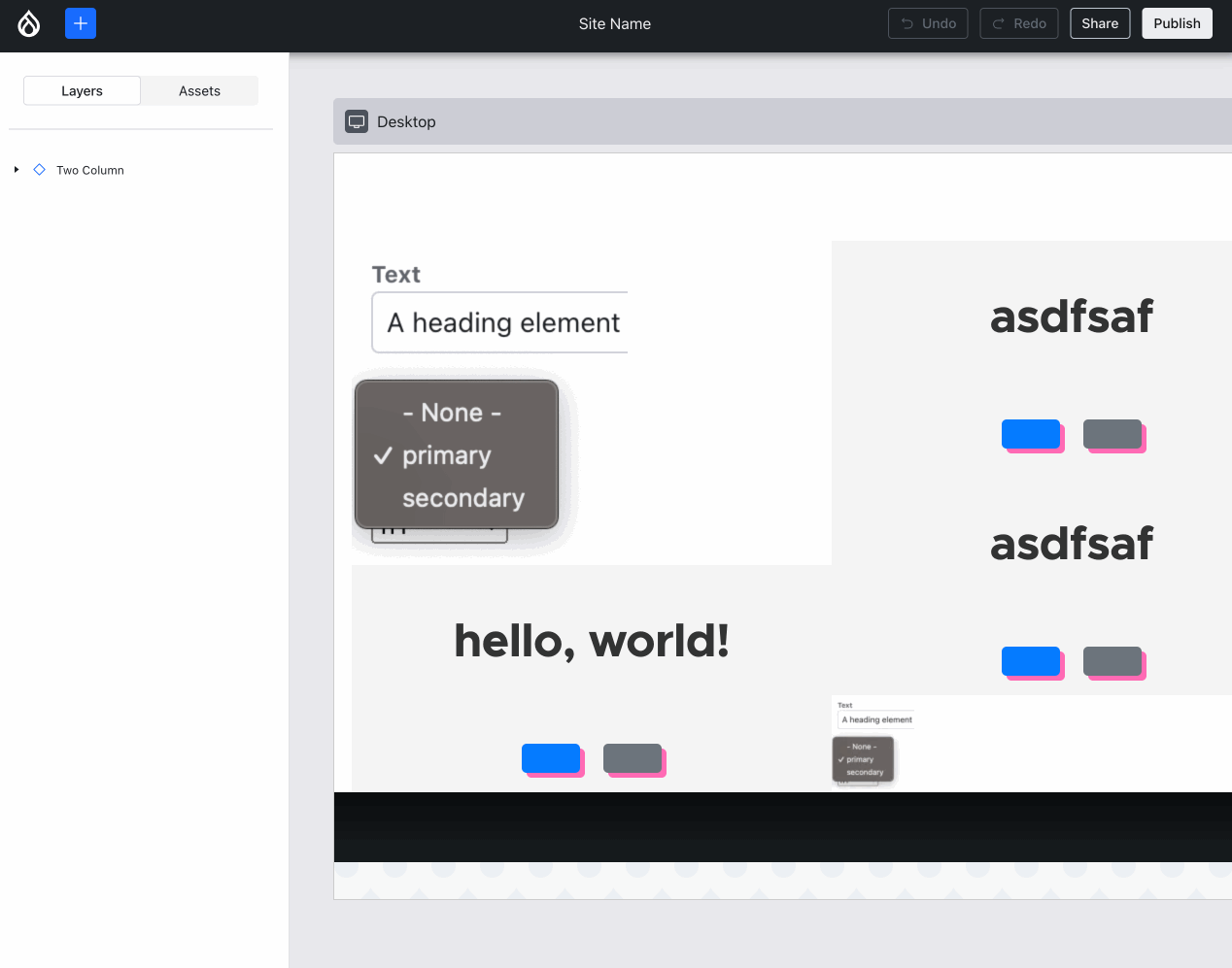
Ben “bnjmnm” Mullins and I (mostly Ben!) collaborated on integrating Media Library! This required expanding some of the lower-level XB infrastructure but most importantly, it means we proved Drupal core’s most complex field widget 1 can work, which is an important milestone:
Using an image from the Media Library. Note how the alt updates, but the image won’t load — more about that later in this post :)
Issue #3454173, image by me.
During the product research phase, Lauri identified that it’s important for Content Creators’ productivity to not have to craft the same combinations of components over and over again. Lauri and the Acquia UX team have labeled such combinations “sections” — similar to Layout Builder’s sections. Creating new ones is out-of-scope for 0.1.0, but conveying what that UX would feel like is in scope. So, Jesse “jessebaker” Baker and Bálint “balintbrews” Kléri worked on a client-only implementation that hardcodes a single section (again: for now):
Using an image from the Media Library. Note how the alt updates, but the image won’t load — more about that later in this post :)
Issue #3463300, image by me.
It takes no designer or expert user to observe that in the above images, the drag-and-drop UX and visualization can be improved. The Figma designs do not have an answer for this. But … we have Bálint! :D He thought, tinkered, experimented and gave the Drupal ecosystem this delightful UX:
A blue line now precedes the ghost while dragging, which conveys both the current position and the target position upon dropping.
Issue #3470973, image by Bálint.
… which subsequently enabled him together with danielveza and Jesse to also highlight the slot that a component is about to be placed in:
The precise destination of a component is has a thick blue line, the containing slot gets a thin outline.
Issue #3469822, image by Bálint.
If that isn’t an epic leap forward on the front end, then I don’t know what is! :D On so many fronts, dragging and dropping components became not only more usable, but also enjoyable.
It doesn’t end there, though:
- Utkarsh “utkarsh_33” updated the styling of text inputs, boolean toggle, etc to match the designs, by mapping more form elements to XB’s React components using the semi-coupled theme engine that Ben introduced in week 10
- Utkarsh, fazilitehreem and Jesse made deleting component instances more intuitive: you can delete the selected one using the keyboard now
- fazilitehreem, Utkarsh and Jesse added right-click support to the selected component
- Jesse fixed a crucial bug that prevented slots in freshly dropped components from working
Missed a prior week? See all posts tagged Experience Builder.
Goal: make it possible to follow high-level progress by reading ~5 minutes/week. I hope this empowers more people to contribute when their unique skills can best be put to use!
For more detail, join the #experience-builder Slack channel. Check out the pinned items at the top!
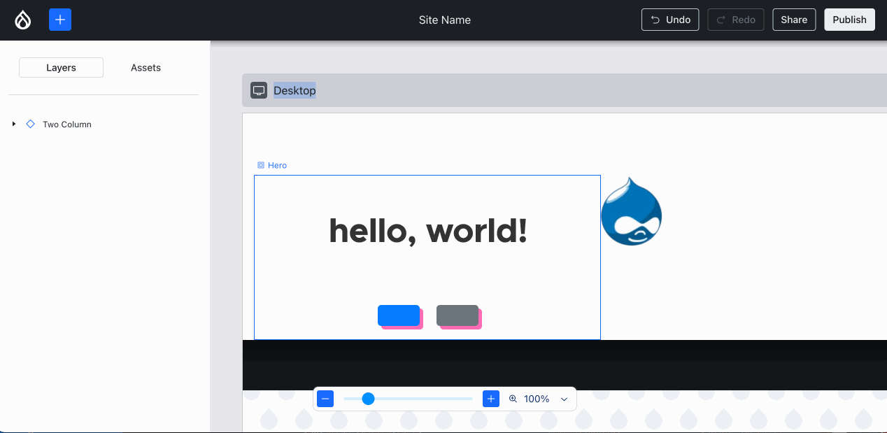
Back endComparatively, the back end progress this week was very non-visual… with one exception: Ted “tedbow” Bowman and I fixed the visually broken “image” components — this was caused by the buggy PoC code I wrote 14 weeks ago — finally this rose to the top of the priorities!
Images now render as expected in Experience Builder. Compare and contrast with the Media Library image above :)
Issue #3469436, image by me.
Feliksas “f.mazeikis” Mazeikis and I discovered a critical bug in the auto-generated Component config entities for Single-Directory Components (SDCs) meeting the criteria: the field type and widget for optional props were missing. How could this happen? Because we’ve been racing ahead to make functionality exist, without the foundations being sufficiently thoroughly checked: the Component config entity’s schema is littered with @todos for adding more validation constraints. One of those would’ve prevented this problem … so we fixed not only the problem at hand, but also ensured that it could never reoccur, by introducing a KeyForEverySdcProp validation constraint first, and then fixing the auto-generation logic.
Dave “longwave” Long, Lee “larowlan” Rowlands and Deepak “deepakkm” Mishra updated XB to declare a runtime rather than development dependency on justinrainbow/json-schema — this is what the SDC subsystem uses to validate that the provided props values are considered acceptable by an SDC, and that’s why XB uses it to validate an XB field is valid (i.e. every SDC in the component tree must be renderable and hence trigger no exceptions for provided SDC props values). So that should’ve been marked as an explicit dependency months ago, but we didn’t spot that. Easy enough!
However … Lee pointed out that this is actually unacceptable for Drupal sites that use JSON:API in production, because it causes automatic validation for every JSON:API response against the JSON:API spec if assertions are enabled. That results in a significant performance regression. That being said, having assertions enabled is also a violation of Drupal best practices (and PHP best practices). Still, Drupal should help users even when they ignore/are unaware of best practices, so the XB module warns on the status report when best practices are violated. A core issue was created to improve this upstream: #3472008.
What a week! :D
Week 17 was September 2–8, 2024.
-
For now, that Media Library dialog looks rather stark, because it is, well … using the Stark theme. We plan to load the Claro/Gin styles, but to ensure style isolation, that requires some non-trivial <iframe> shenanigans in #3471978 to avoid loading that CSS/JS in the context of the XB React app. ↩︎
- The new "layers" panel, which also allows moving components.
- Using an image from the Media Library.
- The sole "section" available right now: one that contains two predefined hero components.
- A blue line now precedes the ghost while dragging, which conveys both the current position and the target position upon dropping
- The precise destination of a component is has a thick blue line, the containing slot gets a thin outline.
- Images now render as expected in Experience Builder.
Tag1 Consulting: Migrating Your Data from D7 to D10:Migrating view modes and field groups
Today, we're building on our previous work with field widget settings. We will cover migrating view modes, a prerequisite for migrating field groups and field formatter settings. We’ll then walk through migrating field groups. Field formatter settings will be addressed in our next article.
Read more mauricio Wed, 09/18/2024 - 05:36Drupal Starshot blog: Drupal CMS Update for The Mid September 2024
We are in the middle of September and that means it’s time for our regular update on what’s going on with the Drupal CMS. Let’s check out what’s new!
Documentation
The Drupal Association is on a mission to bring world-class documentation and maintenance software for Drupal CMS launch and beyond. In order to achieve that, we teamed up with Drupalize.me. Our common goal is to make sure that by the time when Drupal CMS hits the market we have an easy to follow user guide suitable for our target audience. Also we prepared an announcement that will be revealed at DrupalCon Barcelona. Stay tuned for the details!
Contact Form
We are happy to announce that we found a track lead for the Contact form! J. Hogue from Oomph joined the team very recently but has already managed to show progress: he and his team are getting busy with the research and MVP mapping. It’s great to have you with us!
Blog
As per the most recent update from Laurens Van Damme and his team, The MVP version has been set up and now the team is busy with the research on how to align with Drupal CMS standards.
Events
While Martin Anderson-Clutz and his team are considering expanding functionality with the options that will not be applied by default, they are working on a different calendar solution that would have more community support, as well as UX improvement for the date widget. We can’t wait to see the result of their work!
Data Privacy / Compliance
Jürgen Haas tells us that information research and framing the scope of the track has been completed and the team agreed on the documentation. Therefore, the following 3 action items has been set as immediate next priorities:
-
continue documentation
-
break down existing feature list into deliverables/recipes and prioritise them
-
define components for the "Compliance Audit" module as an additional deliverable
Trial experience for Starshot
Some exciting news is coming from Matt Glaman: the trial now displays an interactive installer of Drupal CMS. Meanwhile, the work on styling so the trial would look like the Drupal CMS installer while it is being set up, is full steam on.
Dashboard
The team, lead by Christian López Espínola and Matthew Tift has got the wireframes they can rely on hence now it’s time to get things rolling! They are busy looking deeper into the Gin theme, in particular - config actions for adding blocks to the dashboards from other recipes. There is a decision to be made on whether the right sidebar should consist of shortcuts or individual blocks. At the same time, planning for the upcoming activities is in progress and we are waiting patiently to see more details on what’s ahead.
SEO
Great news from Jim Birch and John Doyle with the SEO track team: Basic and Advanced SEO Recipes have been committed to the repository. Next priority is to continue the iteration process on the recipes, documentation, and guidelines for other tracks.
Content Publishing Workflows
We are most excited to announce that we’ve got one more valuable addition to the team - Mohammed Razem from Vardot is joining the Drupal CMS crew as a track lead of the Content Publishing Workflows track. Welcome on board!
Advanced Search
The 1xINTERNET team has been busy finalising the first version of the concept. The next target for them is to get insights from the survey asking Drupalers what they prefer to use in order to confirm earlier findings from the specification.
Media Management
Tony Barker informs that the Media Track team is researching the features of content management systems identified in the Strategy document as well as working through the information and ideas from the earlier released questionnaire. They keep experimenting with modules and configuration to make necessary choices, with the focus on features that can make it into early recipes over the coming weeks.
Accessibility Tools
From Gareth Alexander we learn the following: as the discovery process and gathering insight on common practices has been finalised, the team has published a survey and is now busy reviewing the results. As review of the current module availability has been completed the list has been simmered down to the ones now being reviewed for feasibility.
This will lead to a proposal for the features and recipes for Accessibility Tools to be considered for inclusion in early versions of Drupal CMS.
Proposal creation is underway and the next steps are being generated.
Analytics
Dharizza Espinach meanwhile shares that the team has finished the market research, and is currently wrapping up the work on a comparison with other tools. The selected tools are to be included in the recipes. Another objective the track team is busy with is preparing the list of recommendations for features that should be included later in the project. The proposal document is underway and iterating over a first version of the basic recipe will be the next step.
AI
Jamie Abrahams is working on something very special that will be released during DrupalCon Barcelona. So I will keep the intrigue and will allow you to discover the details for yourself in just 1 week!
New Track Announcement!
As we make progress with the already defined deliverables, we keep discovering the missing parts of the puzzle. In order to close those gaps, we are excited to announce 2 new tracks we not only set up but managed to get staffed as well:
-
NavigationMatthew Oliveira, Pablo López Escobés from Lullabot. >
-
Gin admin theme track - Known by many, a long time maintainer of the Gin, Sascha Eggenberger became track lead for this milestone.
Our heartfelt welcome to all of the newly acquired Drupal CMS track leads - we are excited to have you and looking forward to all the expertise you are bringing along!
I truly hope you find the news outlined above as exciting as we do and look forward to sharing even more at DrupalCon Barcelona. So if you somehow didn’t get your ticket yet - better hurry up!
LN Webworks: How To Render A Custom Form In Drupal Block
Blocks are basically content containers that are showcased in distinct sections of a website including social sharing buttons, “Who’s online” sections, recently viewed content, and social media feeds. Custom Blocks that are available through GUI operate similarly to node entities. In this guide, you will get a concise overview of their implementations, but primarily focusing on custom blocks developed through the creation of a custom module in Drupal development services.
Step-by-Step Guide To Displaying Custom Forms In Drupal Blocks Step 1: Create a Custom ModuleCreate a directory first by using the following command: =>
mkdir modules/custom/mymodule
Create the Necessary Files
Within the modules/custom/mymodule directory, create the following files:
mymodule.info.yml
src/Plugin/block/CistomBlock.php
src/Form/MyCustomForm.php
Ensure that these files are properly structured to fit the requirements of your module.
1. mymodule.info.yml
Oliver Davies' daily list: De-jargoning Drupal
This week, I learned there is a Drupalisms Working Group - a group focused on de-jargoning Drupal and making it easier for newcomers to Drupal by removing some of the Drupal-specific language.
From the introductory blog post:
If you’re familiar with Drupal, you will have learned its language. You will be familiar with words like Views, Blocks and Paragraphs, and you will appreciate their respective features and functions. But for those new to Drupal, getting to grips with what words mean can mean a steep learning curve.
Drupalisms is something I've discussed on a few episodes of Beyond Blocks, including the most recent episode and the seonc with Eirik Morland.
I didn't realise there were BoF sessions about this at DrupalCon Lille last year, so I'm hoping there will be more next week in Barcelona.
Anything that helps Drupal easier to use and adopt is a good thing.
Horizontal Digital Blog: Why you shouldn't upgrade from Drupal 7
CTI Digital: Unlock Your Marketing Potential with Drupal 11: An In-Depth Guide
As businesses strive to succeed online, the need for an effective content management system (CMS) becomes paramount. Drupal 11, the latest version of this powerful CMS, is packed with new features and improvements designed to enhance your marketing strategy.
We’re excited to share how these advancements can elevate your marketing efforts and help create exceptional digital experiences for your audience.
The Drop Times: Reimagining the Limits of Possibilities
Dear Readers,
"Imagine a world where creating or cloning any application becomes as simple as issuing a command: "Build me that."
The capabilities of AI are evolving at a fast pace, and the developments that have been brought forth are unprecedented. The recent demonstration of the O1 model by Reuven Cohen is a striking testament to this progress. Imagine taking a complex content management system like Drupal, traditionally built on PHP, and seamlessly transforming it into a JavaScript-based platform—all within an hour. This is precisely what the O1 model has achieved. Reuven tested this revolutionary AI by converting the entire Drupal CMS into Node.js, and the results were nothing short of astounding. The model didn't just convert code; it reimagined and replicated the whole system in a new language, paving the way for revolutionary changes in software development.
By providing the O1 model with a detailed prompt, including Drupal's structure, API, and taxonomy, it generated a complete implementation plan in mere seconds.
"It seamlessly transformed the codebase from PHP to JavaScript,"
Reuven noted, emphasizing how the model made cross-language conversion appear effortless. Once the backend was replicated into what can be called 'Drupal.js,' the process moved on to the front end. Utilizing GPT-Engineer, a UI was designed, wrapping up the entire transformation process in just about an hour.
What makes the O1 model truly exceptional is not just its ability to replicate; it goes beyond to fully clone and transform. The AI didn’t stop at code conversion—it provided a clear specification, built the necessary folder and file structure, and even automated the setup process with a bash script. This is more than a mere glimpse into the future; it is a tangible demonstration of how software development could evolve.
As we stand on the brink of this new era, it's clear that these advancements will redefine our approach to software development and open-source projects like Drupal. With tools like the O1 model, the boundaries of what's possible are expanding, making this an exhilarating time for developers and tech enthusiasts alike.
With that, let's move on to the stories from last week.
In an interview with Kazima Abbas, a Sub-Editor of The DropTimes (TDT), Julian Chabrillon, a seasoned full-stack developer at ES IMAGINACION, shares his inspiration behind Noah's Page Builder and how he developed the tool. With the help of his wife and work partner, Sofía García de Blas, he shaped its visual identity, creating a cohesive and user-friendly experience.
Among other notable stories, The DropTimes conducted a video interview with Piyuesh Kumar, the Director of Technology at QED42. Starting as an intern and with almost 14 years with QED42, he watched Drupal evolve from a basic content management framework into a powerful digital experience platform. Piyuesh also shares excitement about his upcoming sessions at DrupalCon Barcelona, where he’ll explore topics like AI’s role in supporting Digital Experience Platforms (DXP) and the importance of designing with privacy in mind, particularly in the context of GDPR.
Last week, Drupal.org refreshed its website with new fonts, transitioning from the previous fonts, Ubuntu and Ubuntu Sans, to ZT Gatha and Noto Sans. This update improves the platform's visual appeal and usability, reflecting the ongoing effort to modernize its design and user experience.
DrupalCon Barcelona is just a week away, and The DropTimes has published several articles and lists to guide attendees through the event. DrupalCon Barcelona 2024, happening from September 24-27, will feature several sessions focused on the Drupal Starshot Initiative, a project aimed at simplifying Drupal while incorporating advanced technologies like AI, no-code tools, and browser-based development. Take a look at 10 key sessions that will provide valuable insights into Drupal’s next steps.
This year’s event also promises to be an exciting convergence of ideas and innovations, with AI taking center stage in a range of sessions. As AI technologies continue to transform the way we build and interact with digital experiences, DrupalCon Barcelona 2024 will feature 13 AI-focused sessions, offering attendees the chance to dive into the latest advancements and explore how AI can revolutionize the future of web development.
Building on the success of DrupalCon Lille 2023 and continuing the partnership with TerraVerde Sustainability, the DrupalCon Barcelona 2024 organizers remain committed to advancing sustainability initiatives and creating lasting positive change. As DrupalCon Barcelona 2024 embraces a greener future, five key sustainability initiatives highlight the event’s commitment to reducing its environmental impact.
While you are there, the Drupal Association invites attendees of DrupalCon Barcelona 2024 to visit its booth to engage with the team, learn more about their ongoing initiatives, and explore ways to contribute to the community.
Meanwhile, we have published a list of Drupal events happening this week for Drupal enthusiasts to attend. Find the content here.
The FOSSEPS and OSOR projects are conducting a survey to assess interest in forming a European Open Source User Group for public administrations. The initiative seeks input from IT professionals within EU public bodies on the current use and challenges of Free and Open Source Software (FOSS).
Darren Oh has introduced the business model behind Drupal Forge, focusing on sustaining Drupal’s software and infrastructure through vendor contributions. Under this model, vendors can partner with product owners, such as the Drupal Association, by offering product trials via launch buttons integrated into their hosting platforms.
Kevin Quillen has taken up maintainership of the Netlify module for Drupal, a key integration that ensures seamless syncing between Drupal and Netlify. This module enables automatic triggering of builds in Netlify whenever changes are made to Drupal’s content or configuration, allowing headless websites, particularly those built on frameworks like Next.js, to stay current without caching issues.
As a final update, Monarq has developed a new system called Sections & Components to simplify content management in Drupal, enhancing user experience by making the platform more intuitive and flexible. This system enables site administrators to build customized, responsive pages by combining predefined sections and components such as text blocks, images, carousels, and call-to-action buttons.
We acknowledge that there are more stories to share. However, due to selection constraints, we must pause further exploration for now.
To get timely updates, follow us on LinkedIn, Twitter and Facebook. You can also, join us on Drupal Slack at #thedroptimes.
Thank you,
Sincerely
Alka Elizabeth
Sub-editor, The DropTimes.
Smartbees: How to Add and Customize The Drupal Admin Toolbar Module?
Increasing work productivity and effectiveness is key in many professions, including Drupal developers. One of the tools that allows you to achieve this is the Drupal Admin Toolbar module. Thanks to it, you can easily access key administrative functions and navigate through admin panels. In this article, you will learn more about the Drupal Admin Toolbar features, benefits, and configuration methods. You will discover the possibilities that this tool has to offer and how it can streamline your Drupal-based website management.
Drupal life hack's: Mastering Dependency Injection in Drupal: A Practical Guide
Specbee: Cooking up irresistible Drupal websites with Recipes
Oliver Davies' daily list: Next week is DrupalCon Barcelona
Next week is DrupalCon in Barcelona.
I'm not speaking this year but if you're there and want to discuss automated testing, test-driven development, static analysis, Sculpin, Tailwind CSS, Nix, or anything else, I'll be there all week and would love to meet up and chat.
Pages
Recent Publications
- Managing Hidden Dependencies in OO Software: a Study Based on Open Source Projects
- Open Source Communities as Liminal Ecosystems
- Investigating developers' email discussions during decision-making in Python language evolution
- Developers, Quality Control and Download Volume in Open Source Software (OSS) Projects
 More...
FLOSS Project Planets
FLOSS Research
- Give Your Input on the State of Open Source Survey
- Open Data and Open Source AI: Charting a course to get more of both
- The Open Source Initiative and the Eclipse Foundation to Collaborate on Shaping Open Source AI (OSAI) Public Policy
- ClearlyDefined v2.0 adds support for LicenseRefs
- ClearlyDefined at SOSS Fusion 2024: a collaborative solution to Open Source license compliance