
Feeds
Python Engineering at Microsoft: Python in Visual Studio Code – August 2024 Release
We’re excited to announce the August 2024 release of the Python and Jupyter extensions for Visual Studio Code!
This release includes the following announcements:
- Improved Python discovery using python-environment-tools
- Inline variable values shown in source code
- Improvements to the VS Code Native REPL for Python
If you’re interested, you can check the full list of improvements in our changelogs for the Python, Jupyter and Pylance extensions.
Improved Python discovery using python-environment-toolsIn the last release, we announced the Python environment tools, which redesigned the Python discovery infrastructure focused on performance. This new approach reduces the need for executing python binaries to probe for information and thus improving performance.
Starting in this release, we are rolling out this enhancement as part of an experiment. If you are interested in trying this out, you can set "python.locator" to "native" in your User settings.json and reload your VS Code window. Visit the python-environment-tools repo to learn more about this feature, ongoing work, and provide feedback.
Inline variable values shown in source codeThe Python Debugger extension introduced an Inline Values feature to enhance your Python debugging experience making it easier to track variable values during a debug session. This feature enables the display of variable values directly in the editor, next to the corresponding line of code during a debugging session. This helps you to quickly understand the state of your program without needing to hover over variables or check the variables pane. To enable this feature, set the configuration value debugpy.showPythonInlineValues to true in your User settings.
Note: This feature is currently in exploration state and improvements are actively being made. Please try out this feature and provide feedback in the vscode-python-debugger repo!
Improvements to the VS Code Native REPL for Python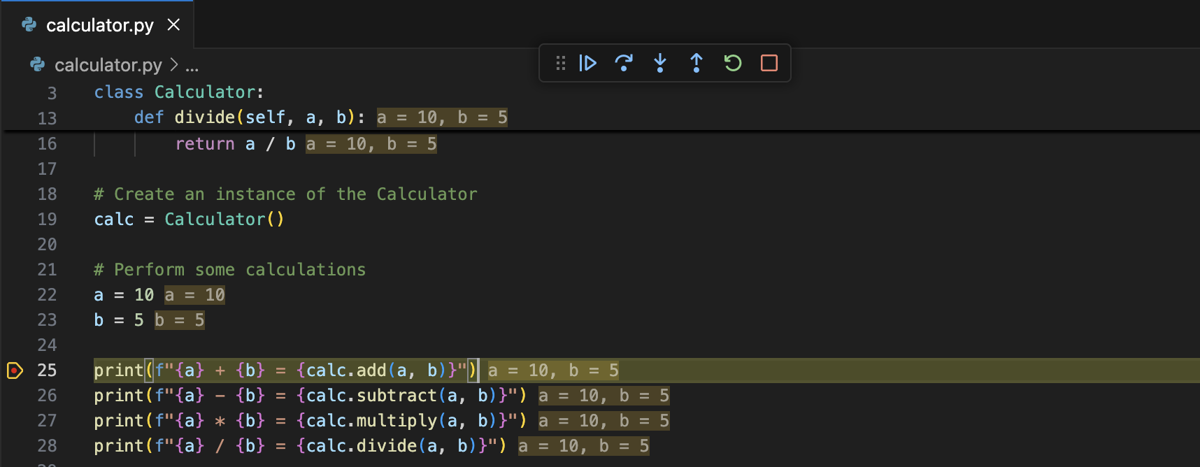
The experimental native REPL ("python.REPL.sendToNativeREPL": true) will now display success/failure UI, similar to that in a Jupyter cell, depending on the outcome of execution. Furthermore, we have made improvements so that we no longer display an empty line on cells that generate no output.
Other Changes and EnhancementsWe have also added small enhancements and fixed issues requested by users that should improve your experience working with Python and Jupyter Notebooks in Visual Studio Code. Some notable changes include:
- Pylance now provides a way to disable unreachability hints in @pylance-release#6106
- The Debug Welcome view now includes a button for quick access to automatic Python configurations when a Python file is open in the editor
As we are planning and prioritizing future work, we value your feedback! Below are a few issues we would love feedback on:
- In a joint effort from various parts of the Python community, we are collecting responses about usage of type annotations in Python. Please take a few minutes to share your experience in the Type Annotation in Python survey! The survey will close at the end of August 2024.
- Design proposal for test coverage in (@vscode-python#22827)
Try out these new improvements by downloading the Python extension and the Jupyter extension from the Marketplace, or install them directly from the extensions view in Visual Studio Code (Ctrl + Shift + X or ⌘ + ⇧ + X). You can learn more about Python support in Visual Studio Code in the documentation. If you run into any problems or have suggestions, please file an issue on the Python VS Code GitHub page.
The post Python in Visual Studio Code – August 2024 Release appeared first on Python.
Jonathan McDowell: Using QEmu for UEFI/TPM testing
This is one of those posts that’s more for my own reference than likely to be helpful for others. If you’re unlucky it’ll have some useful tips for you. If I’m lucky then I’ll get a bunch of folk pointing out some optimisations.
First, what I’m trying to achieve. I want a virtual machine environment where I can manually do tests on random kernels, and also various TPM related experiments. So I don’t want something as fixed as a libvirt setup. I’d like the following:
- It to be fairly lightweight, so I can run it on a laptop while usefully doing other things
- I need a TPM 2.0 device to appear to the guest OS, but it doesn’t need to be a real TPM
- Block device discard should work, so I can back it with a qcow2 image and use fstrim to keep the actual on disk size small, without constraining my potential for file system expansion should I need it
- I’ve no need for graphics, in fact a serial console would be better as it eases copy & paste, especially when I screw up kernel changes
That turns out to be possible, but it took a bunch of trial and error to get there. So I’m writing it down. I generally do this on a Fedora based host system (FC40 at present, but this all worked with FC38 + FC39 too), and I run Debian 12 (bookworm) as the guest. At present I’m using qemu 8.2.2 and swtpm 0.9.0, both from the FC40 packages.
One other issue I spent too long tracking down is that the version of grub 2.06 in bookworm does not manage to pass the TPMEventLog through to the guest kernel properly. The events get measured and the PCRs updated just fine, but /sys/kernel/security/tpm0/binary_bios_measurements doesn’t even get created. Using either grub 2.06 from FC40, or the 2.12 backport in bookworm-backports, makes this work just fine.
Anyway, for reference, the following is the script I use to start the swtpm, and then qemu. The debugcon line can be dropped if you’re not interested in OVMF debug logging. This needs the guest OS to be configured up for a serial console, but avoids the overhead of graphics emulation.
As I said at the start, I’m open to any hints about other options I should be passing; as long as I get acceptable performance in the guest I care more about reducing host load than optimising for the guest.
#!/bin/sh BASEDIR=/home/noodles/debian-qemu if [ ! -S ${BASEDIR}/swtpm/swtpm-sock ]; then echo Starting swtpm: swtpm socket --tpmstate dir=${BASEDIR}/swtpm \ --tpm2 \ --ctrl type=unixio,path=${BASEDIR}/swtpm/swtpm-sock & fi echo Starting QEMU: qemu-system-x86_64 -enable-kvm -m 2048 \ -machine type=q35 \ -smbios type=1,serial=N00DL35,uuid=fd225315-f72a-4d66-9b16-55363c6c938b \ -drive if=pflash,format=qcow2,readonly=on,file=/usr/share/edk2/ovmf/OVMF_CODE_4M.qcow2 \ -drive if=pflash,format=raw,file=${BASEDIR}/OVMF_VARS.fd \ -global isa-debugcon.iobase=0x402 -debugcon file:${BASEDIR}/debian.ovmf.log \ -device virtio-blk-pci,drive=drive0,id=virblk0 \ -drive file=${BASEDIR}/debian-12-efi.qcow2,if=none,id=drive0,discard=on \ -net nic,model=virtio -net user \ -chardev socket,id=chrtpm,path=${BASEDIR}/swtpm/swtpm-sock \ -tpmdev emulator,id=tpm0,chardev=chrtpm \ -device tpm-tis,tpmdev=tpm0 \ -display none \ -nographic \ -boot menu=onSumana Harihareswara - Cogito, Ergo Sumana: Middle Age and Absences
Ruslan Spivak: Up Your Game: Fundamental Skills for Software Engineers
“Fundamentals are the foundation of excellence. Without a strong base, you cannot reach your full potential.” – John Wooden
Hey there!
Let’s talk fundamentals today. Why are they important? John Wooden’s quote sums it up nicely, but let’s unpack it a bit more:
Strong foundation:
A solid grasp of fundamental concepts provides a strong foundation for building advanced skills. Just like a house needs a sturdy base, your knowledge in software engineering needs a solid groundwork. It may sound cliché, but it’s still true.
Continuous learning: fundamentals serve as a launchpad for continuous learning. Once you have a solid base, you can explore more advanced topics and specializations, keeping your skills sharp and relevant.
Confidence: mastering the fundamentals boosts your confidence. Remember, competence breeds confidence.
Shelf-life: technology evolves at a breakneck pace. Remember when new JavaScript frameworks seemed to pop up before your morning coffee? Or just look at how quickly the AI space is advancing these days. While frameworks come and go, fundamentals like data structures, algorithms, math, software design, OS internals, and soft skills have enduring value. Investing in these fundamentals offers a much better return on investment compared to the often fleeting value of the latest frameworks.
Understanding the fundamentals is essential for software engineers at all levels; they’re not just for beginners.
Which specific fundamentals are important for software engineers?
Well, everyone loves a good list, so here you go - an opinionated list of essential fundamentals for software engineers at all levels, from entry-level to senior IC, staff, and beyond:
Programming languages: this one’s super obvious. The main question is which languages? Python, JavaScript, Go, and some C are the usual suspects. Bonus points if you dive into how interpreters and compilers work.
Software design and architecture
Data structures and algorithms (DSA)
Operating systems: this also includes basic computer architecture and networking.
Databases: design and internals
Distributed systems: nowadays, systems run on multiple machines and instances, so understanding the basics of distributed systems is important.
Math: this might be controversial, but it can also be the secret sauce, especially statistics and math for AI.
Soft skills: fundamental to any engineer’s career unless you’re living in a cave alone. The truth is, soft skills are actually hard to master.
Consider this a teaser! I’ll be doing deep dives into these fundamentals in upcoming posts, along with other key essentials for software engineers.
Spotlight
In today’s spotlight: “The Pragmatic Programmer: Your Journey to Mastery”
Andy Hunt and Dave Thomas offer a wealth of practical advice, timeless tips, and real-world examples. Every software engineer needs “The Pragmatic Programmer” on their shelf. Now in its second (20th anniversary) edition, this book is a must-read. I fondly remember the original edition titled “From Journeyman to Master.” My copy is well-worn from many reads - truly good books are worth revisiting.
Sneak Peak
In the next post, I’ll talk about essential fundamentals for engineering managers.
Stay curious,
Ruslan
FSF Blogs: Let's not celebrate CrowdStrike -- let's point to a better way
Real Python: How to Write an Installable Django App
In the Django framework, a project refers to the collection of configuration files and code for a particular website. Django groups business logic into what it calls apps, which are the modules of the Django framework. There’s plenty of documentation on how to structure your projects and the apps within them, but when it comes time to package an installable Django app, information is harder to find.
In this tutorial, you’ll learn how to take an app out of a Django project and package it so that it’s installable. Once you’ve packaged your app, you can share it on PyPI so that others can fetch it through pip.
In this tutorial, you’ll learn:
- What the differences are between writing stand-alone apps and writing apps inside of projects
- How to create a pyproject.toml file for publishing your Django app
- How to bootstrap Django outside of a Django project so you can test your app
- How to test across multiple versions of Python and Django using nox
- How to publish your installable Django app to PyPI using Twine
This tutorial includes a working package to help guide you through the process of making an installable Django app. You can download the source code by clicking the link below:
Get Your Code: Click here to download the free sample code that shows you how to write an installable Django app.
PrerequisitesThis tutorial requires some familiarity with Django, pip, PyPI, pyenv—or an equivalent virtual environment tool—and nox. To learn more about these, you can check out the following resources:
- Django Tutorials
- Using Python’s pip to Manage Your Projects’ Dependencies
- How to Publish an Open-Source Python Package to PyPI
- Managing Multiple Python Versions With pyenv
Even if you set out to make your Django app available as a package, you’ll likely start inside a project. In the sample code, you’ll find a 000_before directory that shows the code before the app is moved onto its own, demonstrating the process of transitioning from a Django project to an installable Django app.
You can also download the finished app at the PyPI realpython-django-receipts package page, or install the package by running python -m pip install realpython-django-receipts.
The sample app is a short representation of the line items on a receipt. In the 000_before folder, you’ll find a directory named sample_project that contains a working Django project:
sample_project/ │ ├── receipts/ │ ├── fixtures/ │ │ └── receipts.json │ │ │ ├── migrations/ │ │ ├── 0001_initial.py │ │ └── __init__.py │ │ │ ├── __init__.py │ ├── admin.py │ ├── apps.py │ ├── models.py │ ├── tests.py │ ├── urls.py │ └── views.py │ ├── sample_project/ │ ├── __init__.py │ ├── asgi.py │ ├── settings.py │ ├── urls.py │ └── wsgi.py │ ├── db.sqlite3 ├── manage.py ├── resetdb.sh └── runserver.shThis tutorial was written using Django 5.0.7 and it was tested with Python 3.8 through 3.12. All of the steps outlined in this tutorial should be compatible with earlier versions of Django going back to Django 1.8. However, some modifications will be necessary if you’re using Python 2. For simplicity, the examples in this tutorial assume at least Python 3.8 across the code base.
Creating the Django Project From ScratchThe sample project and receipts app were created using the Django admin command and some small edits. To start, run the following code inside of a clean virtual environment:
Shell $ python -m pip install Django $ django-admin startproject sample_project $ cd sample_project $ python manage.py startapp receipts Copied!This creates the sample_project project directory structure and a receipts app subdirectory with template files that you’ll use to create your installable Django app.
Next, the sample_project/settings.py file needs a few modifications:
- Add "127.0.0.1" to the ALLOWED_HOSTS setting so you can test locally.
- Add "receipts" to the INSTALLED_APPS list.
You’ll also need to register the receipts app’s URLs in the sample_project/urls.py file. To do so, add path("receipts/", include("receipts.urls")) to the url_patterns list. Note that you’ll need to add the include function as an import from django.urls.
Exploring the Receipts Sample AppThe app consists of two ORM model classes: Item and Receipt. The Item class contains database field declarations for a description and a cost. The cost is contained in a DecimalField. It’s never a good idea to use floating-point numbers to represent money. Instead, you should always use fixed-point numbers when dealing with currencies.
The Receipt class is a collection point for Item objects. This is achieved with a ForeignKey on Item that points to Receipt. Receipt also includes total() for getting the total cost of Item objects contained in the Receipt:
Read the full article at https://realpython.com/installable-django-app/ »[ Improve Your Python With 🐍 Python Tricks 💌 – Get a short & sweet Python Trick delivered to your inbox every couple of days. >> Click here to learn more and see examples ]
Zero to Mastery: Python Monthly Newsletter 💻🐍
FSF Events: Free Software Directory meeting on IRC: Friday, August 2, starting at 12:00 EDT (16:00 UTC)
The Drop Times: ECA is For Every Drupal Site Out There: Jürgen Haas
Real Python: Quiz: Python's Built-in Exceptions: A Walkthrough With Examples
In this quiz, you’ll test your understanding of the most commonly used built-in exceptions in Python.
Exception handling is a core topic in Python. Knowing how to use some of the most common built-in exceptions can help you to debug your code and handle your own exceptions.
Good luck!
[ Improve Your Python With 🐍 Python Tricks 💌 – Get a short & sweet Python Trick delivered to your inbox every couple of days. >> Click here to learn more and see examples ]
Russ Allbery: Review: The Book That Wouldn't Burn
Review: The Book That Wouldn't Burn, by Mark Lawrence
Series: Library Trilogy #1 Publisher: Ace Copyright: 2023 ISBN: 0-593-43793-4 Format: Kindle Pages: 561The Book That Wouldn't Burn is apparently high fantasy, but of the crunchy sort that could easily instead be science fiction. It is the first of a trilogy.
Livira is a young girl, named after a weed, who lives in a tiny settlement in the Dust. She is the sort of endlessly curious and irrepressible girl who can be more annoying than delightful to adults who are barely keeping everyone alive. Her settlement is not the sort of place that's large enough to have a name; only their well keeps them alive in the desert and the ever-present dust. There is a city somewhere relatively near, which Livira dreams of seeing, but people from the settlement don't go there.
When someone is spotted on the horizon approaching the settlement, it's the first time Livira has ever seen a stranger. It's also not a good sign. There's only one reason for someone to seek them out in the Dust: to take. Livira and the other children are, in short order, prisoners of the humanoid dog-like sabbers, being dragged off to an unknown fate.
Evar lives in the library and has for his entire life. Specifically, he lives in a square room two miles to a side, with a ceiling so high that it may as well be a stone sky. He lived there with his family before he was lost in the Mechanism. Years later, the Mechanism spit him out alongside four other similarly-lost kids, all from the same library in different times. None of them had apparently aged, but everyone else was dead. Now, years later, they live a strange and claustrophobic life with way too much social contact between way too few people.
Evar's siblings, as he considers them, were each in the Mechanism with a book. During their years in the Mechanism they absorbed that book until it became their focus and to some extent their personality. His brothers are an assassin, a psychologist, and a historian. His sister, the last to enter the Mechanism and a refugee from the sabber attack that killed everyone else, is a warrior. Evar... well, presumably he had a book, since that's how the Mechanism works. But he can't remember anything about it except the feeling that there was a woman.
Evar lives in a library in the sense that it's a room full of books, but those books are not on shelves. They're stacked in piles and massive columns, with no organizational system that any of them could discern. There are four doors, all of which are closed and apparently impenetrable. In front of one of them is a hundred yards of char and burned book remnants, but that door is just as impenetrable as the others. There is a pool in the center of the room, crops surrounding it, and two creatures they call the Soldier and the Assistant. That is the entirety of Evar's world.
As you might guess from the title, this book is about a library. Evar's perspective of the library is quite odd and unexplained until well into the book, and Livira's discovery of the library and subsequent explorations are central to her story, so I'm going to avoid going into too many details about its exact nature. What I will say is that I have read a lot of fantasy novels that are based around a library, but I don't think I've ever read one that was this satisfying.
I think the world of The Book That Wouldn't Burn is fantasy, in that there are fundamental aspects of this world that don't seem amenable to an explanation consistent with our laws of physics. It is, however, the type of fantasy with discoverable rules. Even better, it's the type of fantasy where discovering the rules is central to the story, for both the characters and the readers, and the rules are worth the effort. This is a world-building tour de force: one of the most engrossing and deeply satisfying slow revelations that I have read in a long time. This book is well over 500 pages, the plot never flags, new bits of understanding were still slotting into place in the last chapter, and there are lots of things I am desperately curious about that Lawrence left for the rest of the series. If you like puzzling out the history and rules of an invented world and you have anything close to my taste in characters and setting, you are going to love this book.
(Also, there is at least one C.S. Lewis homage that I will not spoil but that I thought was beautifully done and delightfully elaborated, and I am fairly sure there is a conversation happening between this book and Philip Pullman's His Dark Materials series that I didn't quite untangle but that I am intrigued by.)
I do need to offer a disclaimer: Livira is precisely the type of character I love reading about. She's stubborn, curious, courageous, persistent, egalitarian, insatiable, and extremely sharp. I have a particular soft spot for exactly this protagonist, so adjust the weight of my opinion accordingly. But Lawrence also makes excellent use of her as a spotlight to illuminate the world-building. More than anything else in the world, Livira wants to understand, and there is so much here to understand.
There is an explanation for nearly everything in this book, and those explanations usually both make sense and prompt more questions. This is such a tricky balance for the writer to pull off! A lot of world-building of this sort fails either by having the explanations not live up to the mysteries or by tying everything together so neatly that the stakes of the world collapse into a puzzle box. Lawrence avoids both failures. This world made sense to me but remained sufficiently messy to feel like humans were living in it. I also thought the pacing and timing were impeccable: I figured things out at roughly the same pace as the characters, and several twists and turns caught me entirely by surprise.
I do have one minor complaint and one caveat. The minor complaint is that I thought one critical aspect of the ending was a little bit too neat and closed. It was the one time in the book where I thought Lawrence simplified his plot structure rather than complicated it, and I didn't like the effect it had on the character dynamics. There is, thankfully, the promise of significant new complications in the next book.
The caveat is a bit harder to put my finger on, but a comparison to Alaya Dawn Johnson's The Library of Broken Worlds might help. That book was also about a library, featured a protagonist thrown into the deep end of complex world-building, and put discovery of the history and rules at the center of the story. I found the rules structure of The Book That Wouldn't Burn more satisfyingly complicated and layered, in a way that made puzzle pieces fit together in my head in a thoroughly enjoyable way. But Johnson's book is about very large questions of identity, history, sacrifice, and pain, and it's full of murky ambiguity and emotions that are only approached via metaphor and symbolism. Lawrence's book is far more accessible, but the emotional themes are shallower and more straightforward. There is a satisfying emotional through-line, and there are some larger issues at stake, but it won't challenge your sense of morality and justice the way that The Library of Broken Worlds might. I think which of those books one finds better will depend on what mood you're in and what reading experience you're looking for.
Personally, I was looking for a scrappy, indomitable character who would channel her anger into overcoming every obstacle in the way of thoroughly understanding her world, and that's exactly what I got. This was my most enjoyable reading experience of the year to date and the best book I've read since Some Desperate Glory. Fantastic stuff, highly recommended.
Followed by The Book That Broke the World, and the ending is a bit of a cliffhanger so you may want to have that on hand. Be warned that the third book in the series won't be published until 2025.
Rating: 9 out of 10
Matthew Palmer: Health Industry Company Sues to Prevent Certificate Revocation
It’s not often that a company is willing to make a sworn statement to a court about how its IT practices are incompatible with the needs of the Internet, but when they do… it’s popcorn time.
The CombatantsIn the red corner, weighing in at… nah, I’m not going to do that schtick.
The plaintiff in the case is Alegeus Technologies, LLC, a Delaware Corporation that, according to their filings, “is a leading provider of a business-tobusiness, white-label funding and payment platform for healthcare carriers and third-party administrators to administer consumer-directed employee benefit programs”. Not being subject to the US’ bonkers health care system, I have only a passing familiarity with the sorts of things they do, but presumably it involves moving a lot of money around, which is sometimes important.
The defendant is DigiCert, a CA which, based on analysis I’ve done previously, is the second-largest issuer of WebPKI certificates by volume.
The HistoryAccording to a recently opened Mozilla CA bug, DigiCert found an issue in their “domain control validation” workflow, that meant it may have been possible for a miscreant to have certificates issued to them that they weren’t legitimately entitled to. Given that validating domain names is basically the “YOU HAD ONE JOB!” of a CA, this is a big deal.
The CA/Browser Forum Baseline Requirements (BRs) (which all CAs are required to adhere to, by virtue of their being included in various browser and OS trust stores), say that revocation is required within 24 hours when “[t]he CA obtains evidence that the validation of domain authorization or control for any Fully‐Qualified Domain Name or IP address in the Certificate should not be relied upon” (section 4.9.1.1, point 5).
DigiCert appears to have at least tried to do the right thing, by opening the above Mozilla bug giving some details of the problem, and notifying their customers that their certificates were going to be revoked. One may quibble about how fast they’re doing it, but they’re giving it a decent shot, at least.
A complicating factor in all this is that, only a touch over a month ago, Google Chrome announced the removal of another CA, Entrust, from its own trust store program, citing “a pattern of compliance failures, unmet improvement commitments, and the absence of tangible, measurable progress in response to publicly disclosed incident reports”. Many of these compliance failures were failures to revoke certificates in a timely manner. One imagines that DigiCert would not like to gain a reputation for tardy revocation, particularly at the moment.
The Legal ActionNow we come to Alegeus Technologies. They’ve opened a civil case whose first action is to request the issuance of a Temporary Restraining Order (TRO) that prevents DigiCert from revoking certificates issued to Alegeus (which the court has issued). This is a big deal, because TROs are legal instruments that, if not obeyed, constitute contempt of court (or something similar) – and courts do not like people who disregard their instructions. That means that, in the short term, those certificates aren’t getting revoked, despite the requirement imposed by root stores on DigiCert that the certificates must be revoked. DigiCert is in a real “rock / hard place” situation here: revoke and get punished by the courts, or don’t revoke and potentially (though almost certainly not, in the circumstances) face removal from trust stores (which would kill, or at least massively hurt, their business).
The reasons that Alegeus gives for requesting the restraining order is that “[t]o Reissue and Reinstall the Security Certificates, Alegeus must work with and coordinate with its Clients, who are required to take steps to rectify the certificates. Alegeus has hundreds of such Clients. Alegeus is generally required by contract to give its clients much longer than 24 hours’ notice before executing such a change regarding certification.”
In the filing, Alegeus does acknowledge that “DigiCert is a voluntary member of the Certification Authority Browser Forum (CABF), which has bylaws stating that certificates with an issue in their domain validation must be revoked within 24 hours.” This is a misstatement of the facts, though. It is the BRs, not the CABF bylaws, that require revocation, and the BRs apply to all CAs that wish to be included in browser and OS trust stores, not just those that are members of the CABF. In any event, given that Alegeus was aware that DigiCert is required to revoke certificates within 24 hours, one wonders why Alegeus went ahead and signed agreements with their customers that required a lengthy notice period before changing certificates.
What complicates the situation is that there is apparently a Master Services Agreement (MSA) that states that it “constitutes the entire agreement between the parties” – and that MSA doesn’t mention certificate revocation anywhere relevant. That means that it’s not quite so cut-and-dried that DigiCert does, in fact, have the right to revoke those certificates. I’d expect a lot of “update to your Master Services Agreement” emails to be going out from DigiCert (and other CAs) in the near future to clarify this point.
Not being a lawyer, I can’t imagine which way this case might go, but there’s one thing we can be sure of: some lawyers are going to able to afford that trip to a tropical paradise this year.
The Security IssuesThe requirement for revocation within 24 hours is an important security control in the WebPKI ecosystem. If a certificate is misissued to a malicious party, or is otherwise compromised, it needs to be marked as untrustworthy as soon as possible. While revocation is far from perfect, it is the best tool we have.
In this court filing, Alegeus has claimed that they are unable to switch certificates with less than 24 hours notice (due to “contractual SLAs”). This is a pretty big problem, because there are lots of reasons why a certificate might need to be switched out Very Quickly. As a practical example, someone with access to the private key for your SSL certificate might decide to use it in a blog post. Letting that sort of problem linger for an extended period of time might end up being a Pretty Big Problem of its own. An organisation that cannot respond within hours to a compromised certificate is playing chicken with their security.
The TakeawaysContractual obligations that require you to notify anyone else of a certificate (or private key) changing are bonkers, and completely antithetical to the needs of the WebPKI. If you have to have them, you’re going to want to start transitioning to a private PKI, wherein you can do whatever you darn well please with revocation (or not). As these sorts of problems keep happening, trust stores (and hence CAs) are going to crack down on this sort of thing, so you may as well move sooner rather than later.
If you are an organisation that uses WebPKI certificates, you’ve got to be able to deal with any kind of certificate revocation event within hours, not days. This basically boils down to automated issuance and lifecycle management, because having someone manually request and install certificates is terrible on many levels. There isn’t currently a completed standard for notifying subscribers if their certificates need premature renewal (say, due to needing to be revoked), but the ACME Renewal Information Extension is currently being developed to fill that need. Ask your CA if they’re tracking this standards development, and when they intend to have the extension available for use. (Pro-tip: if they say “we’ll start doing development when the RFC is published”, run for the hills; that’s not how responsible organisations work on the Internet).
The GivingsIf you’ve found this helpful, consider shouting me a refreshing beverage. Reading through legal filings is thirsty work!
Reproducible Builds (diffoscope): diffoscope 273 released
The diffoscope maintainers are pleased to announce the release of diffoscope version 273. This version includes the following changes:
[ Chris Lamb ] * Factor out version detection in test_jpeg_image. (Re: reproducible-builds/diffoscope#384) * Ensure that 'convert' is from Imagemagick 6.x; we will need to update a few things with IM7. (Closes: reproducible-builds/diffoscope#384) * Correct import of identify_version after refactoring change in 037bdcbb0. [ Mattia Rizzolo ] * tests: + Add OpenSSH key test with a ed25519 key. + Skip the OpenSSH test with DSA key if openssh is >> 9.7 + Support ffmpeg >= 7 that adds some extra context to the diff * Do not ignore testing in gitlab-ci. * debian: + Temporarily remove aapt, androguard and dexdump from the build/test dependencies as they are not available in testin/trixie. Closes: #1070416 + Bump Standards-Version to 4.7.0, no changes needed. + Adjust options to make sure not to pack the python s-dist directory into the debian source package. + Adjust the lintian overrides.You find out more by visiting the project homepage.
ImageX: AI Assistant, Real-Time Collaboration, and More: A Glimpse at CKEditor 5 Premium Features in Drupal
Authored by Nadiia Nykolaichuk.
CKEditor 5 has become a signature innovation in Drupal 10 and a symbol of cutting-edge content editing. As more Drupal websites upgrade, editorial teams can enjoy CKEditor 5’s new and vibrant design, where every detail is crafted for usability and efficiency.
GPG Key Update
Quick note that the yearly extend-the-expiry-of-my-GPG-key has happened early this year, as I realised that my GPG information on FreeBSD infrastructure was outdated. This doesn’t extend the Calamares signing-subkey (not yet) but does add new EC subkeys if that’s your kind of thing. The Calamares signing-subkey is valid until November 2024.
Get the exported public key block here.
PyCoder’s Weekly: Issue #640 (July 30, 2024)
#640 – JULY 30, 2024
View in Browser »
Do you need help making data tables in Python look interesting and attractive? How can you create beautiful display-ready tables as easily as charts and graphs in Python? This week on the show, we speak with Richard Iannone and Michael Chow from Posit about the Great Tables Python library.
REAL PYTHON podcast
This article proposes the top 3 iterators that are most useful from the module itertools, classifies all of the 19 iterators into 5 categories, and then provides brief usage examples for all the iterators in the module itertools.
RODRIGO GIRÃO SERRÃO • Shared by Rodrigo Girão Serrão
Learn how to speed up Python programs on NVIDIA GPUs using Numba, a type-specializing just-in-time compiler. Join the NVIDIA Developer Program to take our ‘Fundamentals of Accelerated Computing with CUDA Python’ course for free →
NVIDIA sponsor
Typically, the asyncio event loop runs in the main thread, but as that is the one used by the interpreter, sometimes you want the event loop to run in a separate thread. This article talks about why and how to do just that.
JASON BROWNLEE
In this quiz, you’ll test your understanding of Python type checking. You’ll revisit concepts such as type annotations, type hints, adding static types to code, running a static type checker, and enforcing types at runtime. This knowledge will help you develop your code more efficiently.
REAL PYTHON
In this quiz, you’ll test your understanding of building a Django blog back end and a Vue front end, using GraphQL to communicate between them. This will help you decouple your back end and front end, handle data persistence in the API, and display the data in a single-page app (SPA).
REAL PYTHON
This PEP proposes a new file format for dependency specification to enable reproducible installation in a Python environment.
PYTHON.ORG
Discusses how to estimate and correct wide-angle lens distortion using straight lines in an image. It covers techniques like the Radon transform, Hough transform, and an iterative optimization algorithm to estimate the distortion parameters and undistort the image. The author also provides Python code to match the division-based undistortion model to the OpenCV distortion model.
HUGO HADFIELD
Using an Azure EventHub with Python is pretty easy thanks to Azure SDK for Python. However, ensuring that your code actually send events into an event hub in a reliable and automated way can be a bit harder. This article demonstrates how you can achieve this thanks to asyncio, docker and pytest.
BENOÎT GODARD • Shared by Benoît Godard
Postgres excels in managing transactional databases. DuckDB offers fast performance for queries and data analysis. Integrating these two databases provides a hybrid solution leveraging the strengths of both transactional and analytical workloads.
CRUNCHY DATA sponsor
In this course, you’ll learn how to work adeptly with the pandas GroupBy while mastering ways to manipulate, transform, and summarize data. You’ll work with real-world datasets and chain GroupBy methods together to get data into an output that suits your needs.
REAL PYTHON course
The cloud gets you scale, but it can also be complicated to price properly. This article covers ten different open source tools that you can use to optimize your deployment and understand the associated costs.
TARUN SINGH
As the AI boom continues, the Hugging Face platform stands out as the leading open-source model hub. In this tutorial, you’ll get hands-on experience with Hugging Face and the Transformers library in Python.
REAL PYTHON
This post talks about a new dashboard tool for visualizing your Strava running data and getting personalized recommendations for your next big race. It is built using Django and includes a LLM integration.
DUARTE O.CARMO
“There are roughly three senses of ‘estimate.’ One is ‘a prediction of how much something will cost.’ One is ‘a guess.’ But another definition is a rough calculation.”
NAT BENNETT
While list comprehensions in Python don’t support the else keyword directly, conditional expressions can be embedded within list comprehension.
TREY HUNNER
A quick post on the the difference between __getattr__ and __getattribute__.
RODRIGO GIRÃO SERRÃO
GITHUB.COM/BLAYLOCKBK • Shared by Brian Blaylock
Maelstrom: A Clustered Test Runner for Python and RustGITHUB.COM/MAELSTROM-SOFTWARE • Shared by Neal Fachan
Events Weekly Real Python Office Hours Q&A (Virtual) July 31, 2024
REALPYTHON.COM
August 1, 2024
MEETUP.COM
August 1, 2024
SYPY.ORG
August 3, 2024
OPENLAB.EC
August 5, 2024
J.MP
August 8, 2024
MEETUP.COM
Happy Pythoning!
This was PyCoder’s Weekly Issue #640.
View in Browser »
[ Subscribe to 🐍 PyCoder’s Weekly 💌 – Get the best Python news, articles, and tutorials delivered to your inbox once a week >> Click here to learn more ]
Making sense of font selection
It’s been a while since my last blog post regarding text. Since then I’ve been working on the on-canvas text tool, as well as multiple reworks for rich text editing, the actual text properties docker for this rich text editing, and finally I’ve done a talk at the Libre Graphics Meeting about my work on the text tool.
I’m now at the point that I’m going over each property and thoroughly polish it. Because I’m also doing frequent updates on the krita-artists forum, I’m hoping to punctuate each polish session with an introduction to the property, and because I also have a lot of technical things to talk about, I’ll be making technical blog posts alongside that, of which this will be the first.
So the first thing that needed to be tackled after putting together the basic text properties docker and the related interaction is font selection. Krita’s text tool is based on SVG+CSS, and uses FontConfig to select fonts. Typically, a font selection widget will show the list fonts, and in some cases, it organises this in two dropdowns, where the first is the font family, and the second a sub family, like italic or bold. So obviously there’s meta data for this, right, and you should just plug that in the right places, and everything’s peachy? Well, we do have a lot of meta data…
Family RelationsFor digital fonts, the OpenType format (in both ttf and otf flavours), is the most common digital format. For formats older than it, the family relations are usually limited to regular, italic, bold and bold-italic (‘RIBBI’), but OpenType also allows for weight/width/slant (‘WWS’) organisation, or even a completely arbitrary organisation under a single typographic family. All at once, too, because not all programs have the same font selection features. These are stored in OpenType names 1, 2, 16, 17 and 21, 22. You can model their relationship as a tree, as in the following example, where we have a single typographic family with a sans, a serif, both of which are WWS families, and each has a variety of RIBBI subfamilies, some of them (semibold) being a single font:
- Typographic family (ids 16, 17)
- Sans (WWS family, ids 21, 22)
- Regular (RIBBI, ids 1 and 2)
- Regular
- Italic
- Bold
- Bold italic
- Condensed (width variant)
- Regular
- Italic
- Bold
- Bold italic
- Semi-bold
- Regular
- Regular (RIBBI, ids 1 and 2)
- Serif
- Regular
- Regular
- Italic
- Etc…
- Regular
- Sans (WWS family, ids 21, 22)
This is of course not only stored in the names, it is also stored in the OS/2.fsSelection flags, and for WWS, there’s width and weight data in the OS/2 table. However for typographic family, there’s no way to identify separate WWS families besides the WWS name being present (besides a bit flag in fsSelection, which indicates there’s only one WWS family, but this too cannot be relied on). Furthermore, variable fonts don’t have subfamilies, but rather “axes”, and perhaps some “instances”, which are internal presets of those axes.
And that’s not all, not all fonts are required to have this data, only fonts that are not sufficiently described without all names present, so the default font of a given font family only needs names 1 and 2 to be present, the semibold only names 1, 2, 16 and 17, and so on.
FontConfig is somewhat build to handle this, the default ordering ( undocumented , of course) of the font family names being WWS, Typographic and finally the RIBBI family name. However, The WWS family name is quite recent, meaning there’s many fonts that only have a typographic and RIBBI name, despite having a difference in, say, optical size data, or one of those layer typefaces.
This works because many of these font selector widgets don’t select a family, but rather, they present a bit of ordering for you to select a font and finally store a specific identifier to that font, like the PostScript name, in the text object. Because we’re using CSS however, we store the font family, and specify the weight, width and slant. This has its benefits, as when a font is absent, we can still infer the intention that something was to be set bold or italic. But that does require that the font can be selected by family at all, so if FontConfig cannot associate a WWS family, that is kind of a problem.
Finally, some fonts have a STAT table, which gives even more info about those axes (if a variable font) and allows for non-variable families to describe their relations in an axis like manner. There’s no API to retrieve this info in Harfbuzz, however, FontConfig knows nothing about it either, and even the CSS working group hasn’t made any statements on whether to interpret the STAT table at all. Mind you, even with api for the STAT table, too many fonts don’t have it, so it is not a solution in itself.
Family ReunionSo, the best way to go about this is to sort the font families. This will require opening each font file up with FreeType or Harfbuzz, and retrieving the data you need, as fontconfig doesn’t store everything we need to identify the different families.
For this purpose, I created a struct to put the data in, and organized the structs inside KisForest, which is a templated container class that allows storing data in a tree, and provides a bunch of itterators to traverse said tree. This allows me to create a top level node (‘typographic family’ node) for each font as I find them, and then sort fonts into those. Then afterwards, go over each node again and sort them into individual WWS families, as WWS family names are in fact kind of rare, and the majority of fonts that need them don’t have them.
The second sort is done by going over each toplevel typographic node, and then take all the children. Of the children, you first select all “regular” fonts (the ones closest to width: 100%, weight: 400% and no italic or slant), and adding those first, each with their own WWS family, and then sort the rest into those. Care will need to be taken for fonts that have different optical sizes identified as well (there’s, of course, four ways this can be stored: OS/2 optical size range; size OpenType tag; ‘opsz’ variable axis and STAT table axis), as well as keeping track of situations where multiple formats of the same font are installed (The Nimbus family on many Linux distributions is often installed as OpenType font as well as two separate Postscript fonts, I’m currently sorting those into the same font family). For bitmap fonts, you want to sort the separate pixel sizes into the RIBBI family, depending on how you interpret bitmap pixel size.
Once that’s done, the CSS font matching algorithm needs to be implemented. CSS is explicitely vague about what it means by a font family (this whole blog has assumed up till now that if a give subfamily cannot be selected with CSS parameters, it needs to be in a separate WWS family), but it does specify that any localized names should be matched (localized names are rare and only really used for CJK fonts, but they do exist). So in practice, you end up testing all the possible names, that is, OpenType ids 1, 16, and 21, in the order of the lowest child node to the parent (because remember, the most default version of a given family only has id 1, so you want to test that first). Then comes the actual style testing, the algorithm of which is more or less the same along width, weight and slant, with weight being special for having a default range to test first, while slant needs to be multiplied by -1 first, which it needed anyhow to cohere the specs (CSS dictates that positive slant should skew to the right, while the OpenType spec requires negative slant to skew to the right).
After all of that, the filenames that rolled out of matching can be added to the FontConfig search pattern to prioritize them in the regular fallback search, which I am very thankful of.
While nowadays an example like this would be best off using a color font, there’s many examples of older fonts that are meant to be used layered (as in, two text shapes overlapped with the same text but different subfonts). This particular font, Sweetie Summer, predates any discussion about WWS, only having a typographic family and ribbi family, which lead it to be unselectable with fontconfig. PresentationBut getting the matching to work for odd fonts wasn’t the only thing that was necessary. Fonts also needed to be displayed nicely. Even more, I really wanted to integrate them with Krita’s resource system, as that would allow tagging and search. These are important usability features as modern operating systems come with hundreds of fonts, so being able to tag fonts with “cursive” and “display” and then filter on that can make it much easier to find an appropriate font. Not all design programs have this feature, which has led to a number of designers to use a so-called font manager, which effectively allows installing and deinstalling fonts by user-defined group (KDE Plasma even has one of these build in, and I’d be suprised if there wasn’t one for Gnome somewhere). Inkscape has quite recently introduced font collections, whose purpose is similar, and given we spend 2 years reworking our resource system, which can do exactly this, it made sense to try and get this system working.
There’s some quibles however: vast majority of resources within Krita are tied to a file, while such a font family resource is an abstraction of a collection of files. This results in problems with getting a preview generated as well as updating an entry between restarts of Krita.
Then there’s selecting the style. This one is a bit abstract, so bear with me: So, as explained before, CSS selects the font file to use by using the user-defined font-family and a set of parameters (width, weight, slant, etc). This has both the benefit of having a certain intent (whether the text is condensed, or the weight is set heavy), as well as being a good abstraction that encompasses both regular font families and variable fonts.
This abstraction is implemented as each font family resource having a set of axes (for variable fonts these are the axes in the font, for non-variable, these are an accumulation of the different parameters associated with the subfamilies), and styles which form a sort of preset for those given parameters (encompassing the instances of variable fonts, and the actual subfamilies in non-variable fonts). This way, you can have fonts that use the OS/2.fsSelection bitflags for indicating bold and italic, you can have fonts that use the OS/2 table values, you can have fonts that have variable axes, and all these will have the same toggles in the same place. If in the future the STAT table is going to be read, the extra info for that will easily be integrated in the same system.
There’s some more toggles than the WWS parameters though, for example, toggles for synthesize slant and bold. Some people think that nowadays, these are not necessary, but that’s really only true for scripts with few glyphs. In fact, we had to implement synthesized slant and bold because CJK users were having missing it dearly in the new text layout. On the flip side, in European typesetting, synthesized versions are considered ‘dangerous’ as it can be hard to tell if the correct bold version was selected, so a toggle to turn it off is required. This needed some extra work with variable fonts, as active slant and italic axes are not testable in the usual manner. There’s also optical size, though this is only supported for variable fonts that have an ‘opsz’ axis, as the CSS Working Group doesn’t seem to have an opinion on the other three ways optical size can be indicated. Finally there’s the remaining axes, in case of a variable font with extra custom axes.
So, this sounds to work right? Where’s the issue with styles? Well, some might say that the split between a font-family and the style is unnecessary, it would be much better to just see all the styles at once. In fact, Inkscape has been implementing this recently. Which means I’ll be asked why I didn’t implement that, because obviously I should.
The main problem here is a philosophical one. The reason Inkscape is implementing this is because its user base wants this UI, and the reason the user base wants this UI is because other software they’re using has this UI. So far, so good.
However, other software has this UI because it has a different kind of text layout system. As noted before, the font selector in these programs is just a fancy way of selecting a specific font file. Within programming way of saying “select font file XYZ” is considered an ‘imperative’ way of programming. This is quite common in WYSIWYG (what you see is what you get) editors, as its easier to program. Markup based methods like CSS instead has a ‘declarative’ way of programming: “Select from this font family a font with these parameters, and otherwise these other font families”. A system like this usually tries to infer properties, which is harder to program, but also means less properties need to be set.
The philosophical difference here is that I don’t think it is wise to try to abstract away the underlying data structure, because I think it leads to bugs that are kind of hard to articulate if you don’t know the UI is not representing the underlying structure properly. This is also why it is weird to see people go “Well, UI should be completely decoupled from the business logic”, because even if you programmatically decouple UI and data, the fact remains that the UI can only do what the data structure allows. The data structure by itself belies a workflow, which in the case of mark-up based type setting general, is one that focuses on consistency, and that if you want to make a small modification, only a small modification is stored.
The importance of the underlying data structure is something that I always feel is missing from discussions about the UI of Free Open Source Software, which is why I am emphasizing it now. The main idea of “listening to your users” is not bad, and even for my own work I did talk to other artists on KA to try to get a feel of what artists using Krita prioritize. But text in particular is also far more tricky than this, because the main reason both the Inkscape folks and us went with an SVG+CSS based text layout is because it is a specification that is widely used (just not in graphics programs…) and has a lot of thought put into multi-lingual and non-European text handling (which is still quite rare today). And I think it is going to cause trouble if you try to apply UI conventions that belong to a different kind of text layout.
The main issue I foresee with this approach is that there’s no mind paid to font family fallback. In an online situation, font family fallback is mainly for what to do when a font family can be found. In a local situation like a graphics program, it is mostly useful in multi-script situations. Many fonts only have glyphs for a small subset of Unicode, often limited to a single script with supplementary punctuation and numbers. So in multi-script situations the CSS font matching algorithm requires you to check if a glyph can be represented, and if not, you must check other fonts on the system till you find one with the given glyph. Font family fallback allows you to have some control over this mechanism.
The font family list allows us to control the fallback. Many fonts only have glyphs for a subset of unicode, so controlling fallback can allow us to select fonts that seem to be in a similar tradition, like using a Serif Latin font for a Naskh Arabic font. Not all scripts have similar traditions, so control over the font fallback is also useful in selecting a font that may not fit within the same tradition, but might look good in terms of contrast, so the Latin text, in this case, stands out less.Another thing that’s kind of difficult here is that it hides the fluidness of variable fonts. Because where before we could treat instances as a sort of preset for the parameters, they now are presented as a whole font to select. To further explain, one thing I’m fully expecting to happen for Krita is that we receive a bug report with “I turned off synthesis for weight, but still Krita is showing something for a weight value that doesn’t correspond to a style”, and I’ll have to reply with “Yes, that’s because you’re using a variable font”, expand on that, and then close the bug as RESOLVED, NOTABUG. By focusing too much on the styles as individual fonts to select, we’re inhibiting people from updating their mental model of how fonts can work.
VisualsOf course, because there’s so much variation in what the different fonts can do, it is necessary to indicate the capabilities of a font. Many font selectors have at the very least an icon for the font type. Because there’s been a flurry of activity within OpenType in the last decade, there’s now also variable fonts to keep an eye on, and four (five?) different ways to do color font representation, and those can all be present at once. Krita only really supports the Bitmap and ClrV0 implementations, so we need to indicate which color font data is present.
Other than that, the font name should be present. As well as a preview for the given font. We could technically do the latter straight up with the text layout, by putting a KoSvgTextShape inside a QQuickPaintedItem, but I worry that might be slow on some systems. Instead, I’m laying out the text and converting the result to regular paths, storing the SVG, and then painting the path from that within a QQuickPaintedItem. The sample text chosen uses FontConfig supported languages list, though I am wondering if we’re not better off testing CharMap support instead, as to ensure we will always have some glyphs from the font available. Anyway, I’m quite pleased with the result, as it allows us to display the sample nice and sharp.
One thing that is also tricky is the localization. Basically all user-facing strings within OpenType can have localized variants within the font, and if those are present they should be displayed. In practice this means that these localized strings get stored in the KoResource as well. The models for tracking the styles and axes receive a ‘setLocales’ function, so that when the font name is requested within QML, the text label will receive the localized name. However, with the resource model this isn’t feasible, as the font family resource is the only one that holds localized names. Thankfully, a QVariantHash is treated as a javascript object/dict within QML, so the localized names could be stored into the metadata QVariantMap (note that QML does not support converting QVariantHash to a dict(!), and then tested against the KLocalizedString::languages() stringlist (though care must be taken to ensure the underscore is replaced with a dash).
Eventually, we’ll prolly need to do the same with the writing system samples. However, that should probably use the language the text shape is tagged with, as it is very common for multi-lingual artists to keep the software in English, so they won’t have to guess at a translation when doing an internet search for a given label. So in those cases where you’d need a different sample (like, a Arabic sample if you’re typesetting Arabic), it is probably combined with a different language being set on the text. Mind, there’s no language selector yet, because SVG+CSS uses BCP47 language tags, and I haven’t figured out how to capture the richness of those tags in a discovery friendly ui. Being able to limit the visible fonts based on whether fontconfig thinks they support the active language would also be useful in the same vein.
FontConfig Rescan IntervalWhen discussing the architecture of how to implement this, it was mentioned that FontConfig has a rescan mechanism. This is basically FontConfig checking if any changes had happened, and if so, updating the font list, and the default on most Linux systems for this is 30 seconds. I think most programs just turn this off, but the person I was talking with went “oh, yes, this is how you need to implement this”, which was a little confusing because our resource system doesn’t actually support refreshing resources during a session. I ended up implementing what they asked of me, as a show of good faith, but there’s multiple refresh problems with it (because our resource system was not build to handle this). It will probably be disabled in the end, unless the refresh problems turn out to be trivial to tackle.
PostambleA returning theme in handling fonts, OpenType fonts in particular, is that there’s at the least 3-5 ways of doing one common thing. This is not unusual, and often happens when people need a certain function to be part of a specification so badly that there’s no time to standardize. Because of this complexity though, implementing a good font selector still took about a month. At the same time, I’m happy I spend time on this because it would otherwise hang like a thunderstorm over the whole text project, as it would be a matter of time we’d drown in bug reports about this-or-that font not being selectable. That is still going to happen, but at the least there’s a framework to deal with edge cases now.
The next topic I’ll be tackling is probably going to be font size and line height.
Appendix TTF vs OTFSo an OpenType font should be in a file called the Open Type Format (otf), right? Then why are most of them in the True Type Format (ttf)? Aren’t these two the same?
ttf and oft are the same format, yes. The original spec was called TrueType, and the glyphs were outlined with quadratic bezier curves. One of the things that was added when the spec became OpenType, was that the glyphs could now also be outlined in CFF (compact font format, PostScript, basically), which uses cubic bezier curves. Since then, a font stored in a ttf file is an OpenType font with quadratic bezier curves, and a font stored in an otf file is a file with cubic bezier curves. I am unsure whether since the introduction of variable fonts this difference isn’t purely conventional however.
Italics and ObliquesBecause blogpost is aimed at readers that are probably not typography (or lettering/calligraphy) nerds, let’s speed through the history of Latin script as to explain the difference between Italics and Obliques and why they’re sometimes confused:
The history of Latin script is basically the existence of a formal style of writing (a ‘ductus’), and then because clerics need to write a lot, them developing a less formal style that’s easier to write. That one then formalizes, and then a new style is developed. So if we start with Roman Square Capitals (like Trajan), it is followed by a variety of less formal styles like Uncial and Rustic Capitals. Around the middle ages however, the formal ductus and less formal ductus are unified into one system of capital (‘upper case’, also called ‘majuscule’) and miniscule (‘lower case’) letters. However, clerics needed a faster way of writing, so a given blackletter style would often be developed into a chancery or court style.
Fast forward to the Rennaisance. Italians are making their first printing fonts. For reasons I don’t want to get into, they choose Roman Square Capitals for the capitals of their typefaces and combine those with Carolingian miniscules. But they want more typographic richness, so the popular Italic chancery hand is turned into a printing font as well. There’s some notable difference between Carolingian miniscules and Italian miniscules, in particular, the ‘a’ and ‘g’ are written differently, as is the ‘f’:
Then, much later, in the nineteenth century, Sans-serif fonts were introduced, which find their origin in sign-painting. For some reason, these fonts don’t use an Italic ductus for their corresponding slanted style, in fact, the slanted style is just that: slanted (an ‘Oblique’). My best guess is that this is because this font style comes from sign painting and thus is optimized for legibility, and frequently uses an Italic ‘g’, combined with a Carolingian ‘a’ for this purpose. So they may have considered a simple slant much more distinguishable than trying to create a full Italic ductus compatible variant.
By the time computers get involved, a slanted version of the font is considered paramount, as many academic style guides require Italics to indicate quotes and book names. By this time, Oblique variants were considered acceptable, which is why ‘synthesized italic’ just ends up being a digitally slanted version of the original. Fonts that combine both a rare, but exist, so OpenType specifies an extra bit to indicate that a font is specifically an oblique version, but it seems that this didn’t catch on. Even now, with OpenType variable fonts and the STAT table making it much easier to define a slanted version, there’s still hesitance to use it as nobody knows which software supports selecting it.
Furthermore, many other writing systems use various script styles to indicate quotes and such, yet, these are not recognized as ‘Italics’ by computer software. There’s therefore something very arbitrary about Italics by themselves: There’s nothing stopping a font designer from creating a black letter or copperplate style for their font family, except how to handle the font files so that software can select these.
SlantSlant, within variable OpenType fonts, is a different toggle from Italics. And it can go either way, similarly, there is such a thing as a ‘upright Italic’. So that begs the question: why are Italics usually slanted? This has to do with calligraphy, in particular, the reach of the right hand.
Because the right hand has a reach that goes from top-right to bottom-left, it is likely to skew vertical lines to the right.
If you write with a left hand the same as with a right hand, you get the same effect, but flipped.
For lefties like me, to do right-slanting calligraphy we need to either write with our hand over the line, or rotate the paper.
Now, for European scripts, this is usually for italics, but sometimes a slant doesn’t express a calligraphic quirk, but rather a feeling of forward motion. Which is why for right-to-left scripts, you will sometimes see a left-leaning font being used.
Pages
Recent Publications
- Managing Hidden Dependencies in OO Software: a Study Based on Open Source Projects
- Open Source Communities as Liminal Ecosystems
- Investigating developers' email discussions during decision-making in Python language evolution
- Developers, Quality Control and Download Volume in Open Source Software (OSS) Projects
FLOSS Project Planets
- #! code: Drupal 10: An Introduction To Batch Processing With The Batch API
- Mario Hernandez: SOLVED - Cannot crop based on original image after initial crop has been set
- Mario Hernandez: Migrating from Patternlab to Storybook
- Reproducible Builds (diffoscope): diffoscope 276 released
- GSoC 2024: Progress Update